Accessible notifications
- Published at
- Updated at
- Reading time
- 3min
Sara Soueidan just published a free chapter of her Practical Accessibility course; with no surprise, it's high quality.
The chapter is split into two blog posts:
- Accessible notifications with ARIA Live Regions (Part 1)
- Accessible notifications with ARIA Live Regions (Part 2)
I strongly suggest you read these, but disclaimer: you'll need a while to make yourself through them.
For my archive, here are some rough notes from reading the chapter.
To define an element as a live region, you can use the aria-live attribute or go with a live region role (alert, status, log, marquee or timer). From all these roles, alert and status are fair game because they're well supported.
Regions have one advantage over the aria-live attribute.
Another advantage to using a live region role over aria-live is that live region roles accept an accessible name.
Sara explains this fact with a shopping cart.
<span id="cart"><strong>Shopping cart:</strong></span>
<span role="status" id="status" aria-labelledby="cart">
  0 items
</span>
The span comes with role="status", and because of the region role, the element can have an accessible name. The accessible name is defined by aria-labelledby. Cool!
When this live region is announced, the announcement includes the accessible name: "Shopping cart: 0 items". 100 points! 👏
I always expected the following fact, but here it is black on white.
The screen reader will announce the entire contents of a live region as one long string of text, without any of the structure.
A live region announcement is just a long string. There are no semantics. There's no structure. That's why good announcements should be short — no one wants to be interrupted by a novel or confusing message.
And because semantics are stripped, there's another problem with a very common notification pattern: toast widgets that include interactive elements like a "dismiss" button are unsuitable for live regions.
Live regions should not be used for messages or notifications that contain interactive elements, particularly if the user may need to act on those notifications.
What should you do instead? Sara describes how proper focus handling often helps to avoid live regions altogether.
For example, here's her recommendation on how to make SPA navigations more accessible.
Instead of relying on a live region to announce the page change, you could send keyboard focus to the main "h1" of the page which, as we mentioned in the heading structure chapter, should describe the primary topic of the contents of the page and ideally be identical to the page’s "title".
I love it!
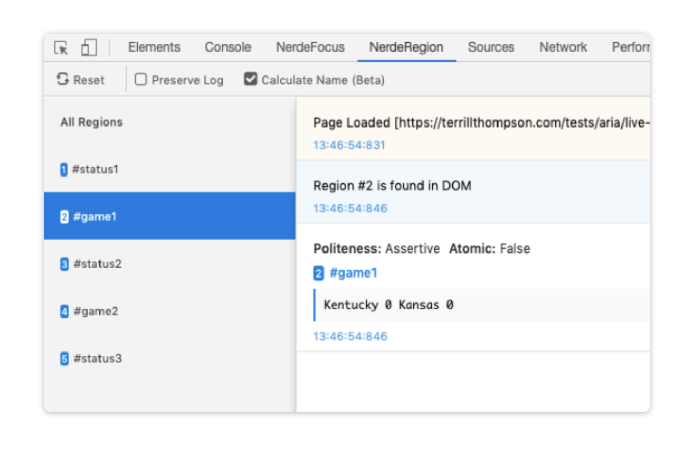
I haven't tried it, but I trust Sara's recommendation here. NerdeRegion allows you to quickly debug Aria Live Regions in your developer tools.
Sara also links to Considering dynamic search results and content as an example of an accessible live search experience. Disclaimer: I haven't read it yet, but it looks like a valuable bookmark.
Alright, here's the end of my rough notes. Go ahead and read Sara's free chapter. It's worth it, I promise!

Join 6.5k readers and learn something new every week with Web Weekly.
Related Topics
Related Articles
- Notes on relying on the ARIA Authoring Practices Guide
- ARIA roles can remove their children’s semantics
- Header & footer elements change their roles when they're inside of sectioning content
- WCAG success criteria that can't be autmatically tested
- A "section" without an accessible name is nothing but a "div"

