Web Weekly #92
- Published at
- Updated at
- Reading time
- 9min
Do you know that the new media query range syntax is almost cross-browser supported? Or that client-side navigation has hard-to-ignore accessibility impacts? Or that native CSS nesting shipped in Safari?
All the answers and much more are included in this week's Web Weekly. 🫣
One of the Arc browser's features is "Boosts" which allow you to inject custom CSS and JavaScript into sites. The idea is not new, but the feature is built into the browser.
BTW: I still have five Arc invites hit reply if you want to try it.
I always wonder if people really change sites because the chances are high that things break with a site update. Is that worth it?
Apparently, many people tweak the web to their liking.
Rach Smith hides shorts from her YT timeline.
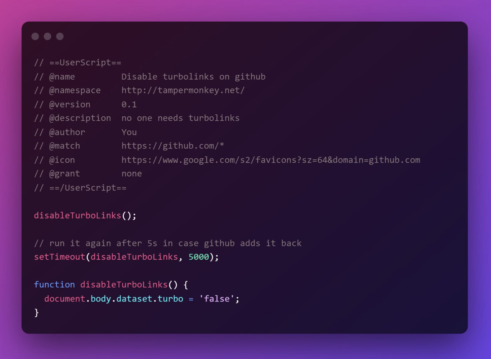
@hi__mayank disables GitHub's wonky Turbolinks navigation and hides the notification bubble.
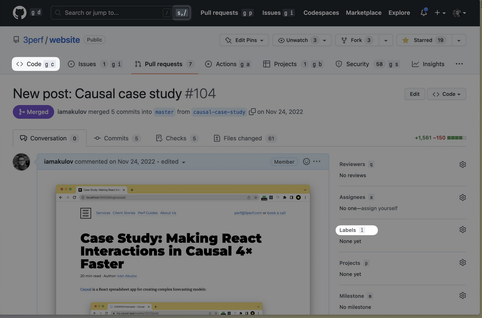
Ivan Akulov displays all GitHub shortcuts right in the UI.
Should I reevaluate? Do you use fancy customizations?
Let's pretend I didn't just waste spend 25 minutes reliving the 90ies by playing Snake right in Google search, okay? 😆
- Web trivia: here are the most visited websites in the world.
- The new Lighthouse 10 dropped TTI and now favors CLS in its performance score by 25% (prev. 15%).
- Discover Mac apps on dockhunt.com.
My Berlin friends are running regular usability tests for their low code, open-source workflow automation tool. All you have to do is to sign-up for a 60 minute video call, where they will guide you through a few tasks. You’ll get rewarded with a 40€ Amazon voucher.
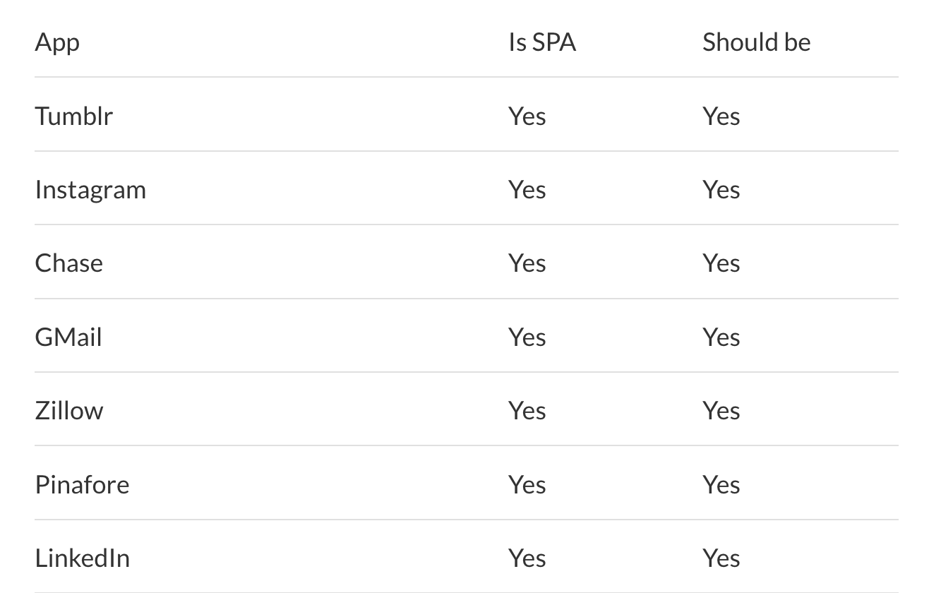
Manuel Matuzović published a not-so-hot hot-take about the downsides of Single Page Apps. It's a fact that client-side navigation messes with default Browser accessibility features.
And that might be okay as long as you understand the implications. Do you build a graphics app, sure — go all in JavaScript. But if your site is primarily driven by content, you may want to evaluate all the downsides. 😉
And while we're at it: Laurie Voss published a very rational and reasonable take explaining why JavaScript frameworks might be a good thing.
Again, there's no right or wrong. But it's important to consider that every tech decision has tradeoffs.
Last week I shared how excited I'm about Interop 2023, and if someone asks me about things that need to be added to CSS, I need help to think of something. I'm just happy there's so much long-awaited stuff in the pipeline.
But indeed, we're not done yet. Pseudo-classes for stickiness, easing gradients or CSS anchoring are only a few handy additions.
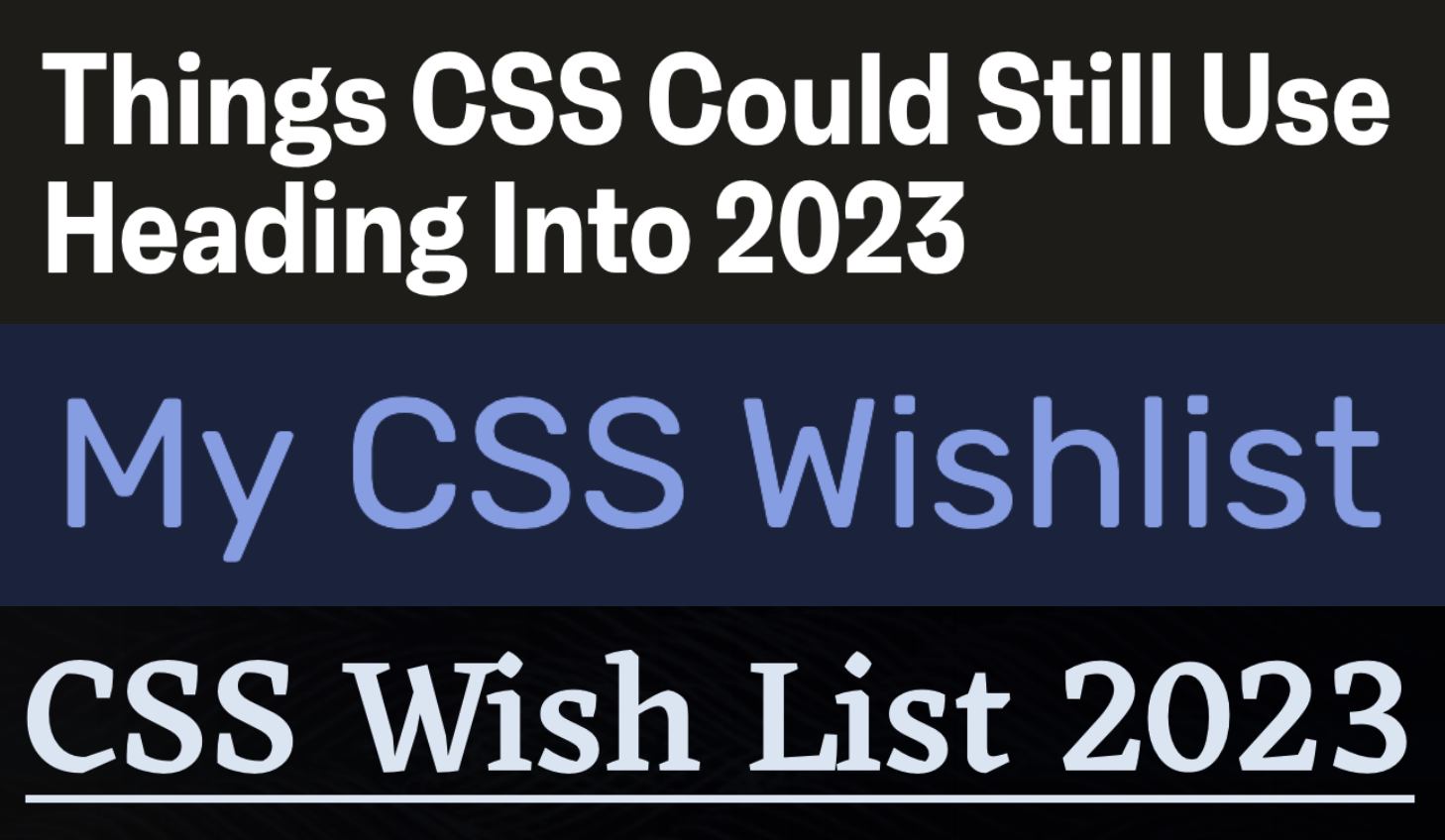
Some folks wrote about their ideas:
- Chris Coyier — Things CSS Could Still Use Heading Into 2023
- Ahmad Shadeed — My CSS Wishlist
- Eric Meyer — CSS Wish List 2023
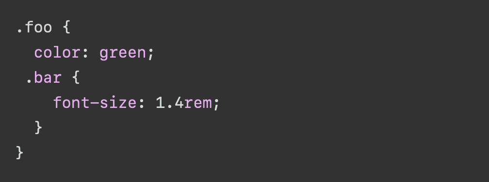
Safari's rushing ahead and shipped native CSS nesting in their Tech Preview. This is a huge addition!
But it comes with some caveats: nested selectors always have to start with a symbol, and it doesn't look like nested selectors like &--active {} will work. So it won't be a drop-in replacement for Sass, PostCSS or other CSS tools.
But hey, I can't wait to ditch tools to use native web features. 👏
It's amazing how well this site works. Move your cursor somewhere and get a picture with a person pointing at it. 😆
What are your favorite internet corners? Shoot them my way, and I'll include them in Web Weekly!
Creating a scaleable CSS architecture to space things takes a lot of work and brain power. That's why new properties like margin-trim are on their way. But I must admit that Andy Bell's favorite * + * {} rule gives me what I need most of the time. 🫣
Mike Crittenden shared how he set up a cron task to clean up his downloads folder automatically. It's a nice tip, but did you know that there's a directory on macOS that's deleted on reboot?
I haven't had to delete files by tweaking some settings for years. 🫣
Years ago, I spent quite some time and set up my dotfiles. The repository includes my entire machine setup. Setting up a new computer takes me 30min, and 95% of it is automated. VS Code, my shell theme and config, my desktop apps; everything will be ready-to-use.
Unfortunately, my dotfiles became a Frankenstein that contains random undocumented scripts creating files and downloading stuff.
But it's now on my TODO list to refactor things and delete some scripts. The described flow of using Git worktrees is the nicest approach to dotfiles I've ever seen. 👇
And if you didn't invest in dotfiles, do it! It's worth it.
I have neither used the meter nor progress element but semantic markup rocks! Dana Byerly published extensive article explaining how to use the elements and why you must use them cautiously.
There was a Dribbble challenge or something, and folks started building electrified buttons. The example using the Greensock animation library looks fantastic, but the one without JavaScript is truly impressive.
From the unlimited knowledge archive called MDN...
Did you know the Media Queries Level 4 specification has a new range syntax? Now you do!
You might wonder about browser support: Safari's still missing, but the syntax will land soon.
If you want to learn more about web development, my @randomMDN Twitter bot posts random MDN pages multiple times a day.
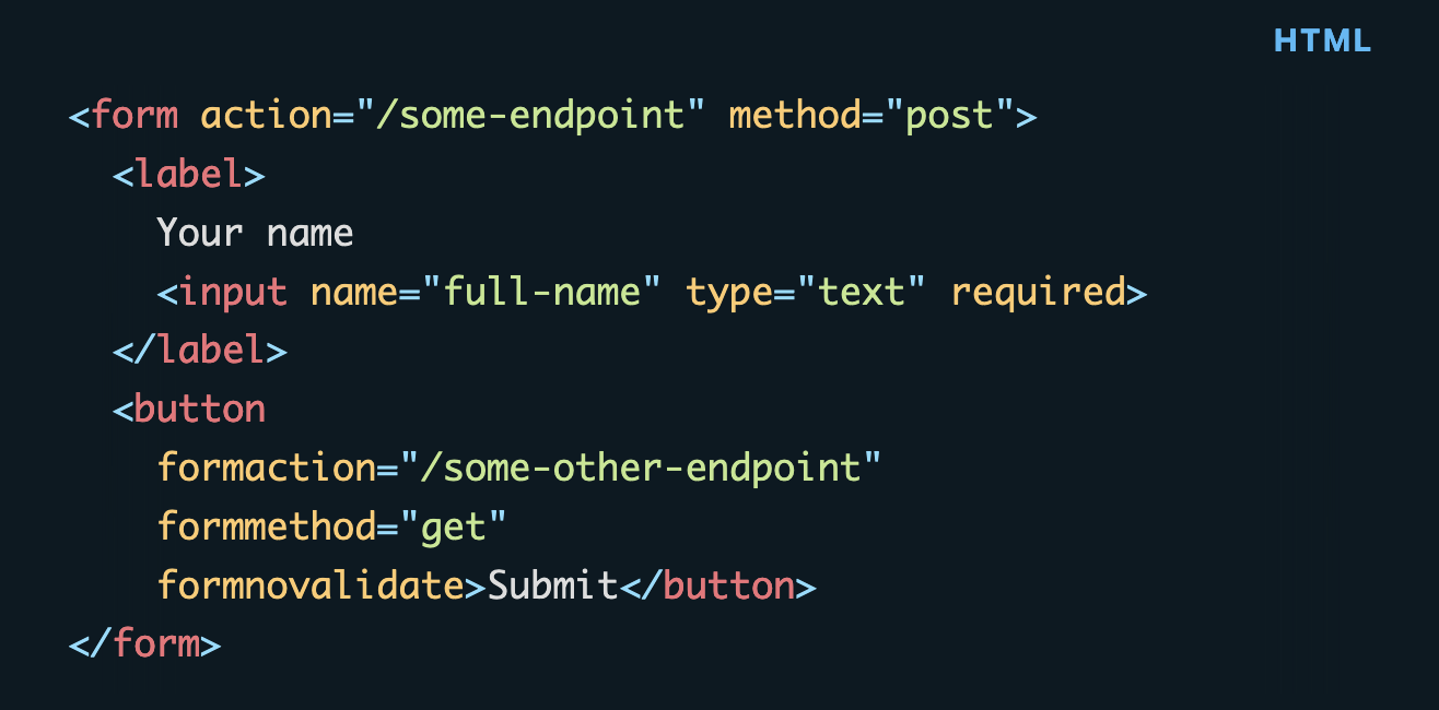
HTML continues to amaze me. Have you ever used the formaction or formmethod attribute on a button? No? Learn what they're about on the blog.
Find more short web development learnings in my "Today I learned" section.
- ds300/patch-package – Fix broken node modules instantly by automatically patching them.
- writefreely/writefreely – A clean, Markdown-based publishing platform made for writers.
- jmforsythe/Git-Heat-Map – Visualise a git repository by diff activity
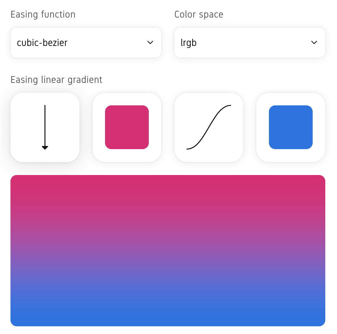
I only knew I needed to up my gradients game once I discovered Easing Gradients. Why? Creating a linear CSS gradient looks okay, but applying some easing makes things much more polished.
Find more single-purpose online tools on tiny-helpers.dev.
And to continue that thread on gradients, the best ones are barely noticeable and blend into the design. Derek Briggs shared some nicely nerdy design details on how to create stellar-looking borders with CSS box-shadow.
If you can tell there is a gradient then it's too much.
This week's track is a wonderfully chilled cover of the Kooks' "Seaside". I love it!
Writing Web Weekly takes me roughly five hours every week, and I pay real money for sending over 3.4k emails. If you enjoy it, consider supporting me on Patreon. ♥️
Or tell your friends about it:
- Share it on Twitter.
- Forward it to someone who might like it.
If you're not a subscriber, change that! 😉
And with that, take care of yourself - mentally, physically, and emotionally. I'll see you next time! 👋
Join 5.8k readers and learn something new every week with Web Weekly.

