Web Weekly #86
- Published at
- Updated at
- Reading time
- 7min
Do you struggle with Unicode in JavaScript? Or curse the vh when designing for mobile? Or always wanted to know how this obscure
All the answers and much more are included in this week's Web Weekly. 🫣
Enjoy!
This edition is the 86th Web Weekly, and for almost two years, I've been sharing weekly Frontend tips (I missed a few, but hey... 🙈).
It's odd that Web Weekly somehow became a part of my life. 💙
This week, I've chatted with my friend Anselm who runs the excellent Web Development Reading List. You should check it out!
We both wondered where we're going with our newsletters and if there's a way to collaborate.
All this got me thinking about Web Weekly.
Is it valuable to send it weekly? Should it be focussed on a specific topic rather than only including the things I liked during the week?
As we're almost closing the year, I'd love to know what you think of Web Weekly. Why did you subscribe? Is the format good as it is? Should I cut something?
Reply to this email or send me an email. Thank you!
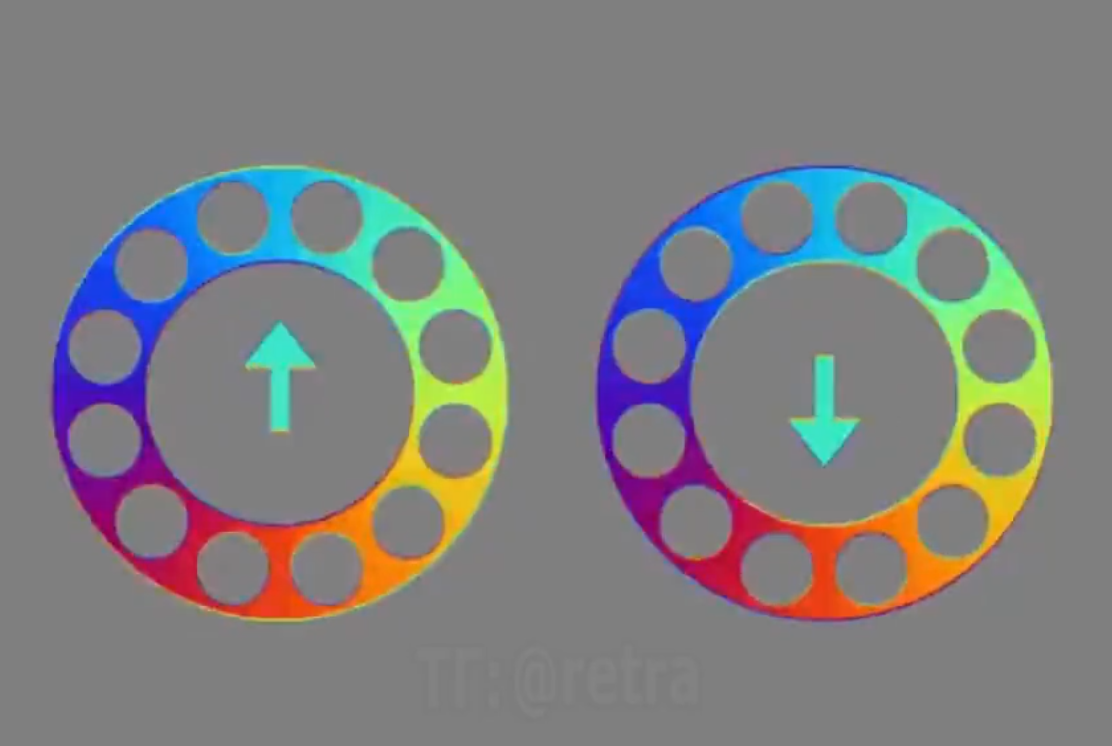
I've seen a few of these optical illusions tricking the brain, but this one is wild!
- The development of View Transitions (formerly shared element transitions) for MPAs has begun! 💯
- HazeOver is a small util app helping tame all these windows on macOS.
- For the Tailwind users: Tailwind Weekly is a newsletter to stay on top of all these utils. 🙈
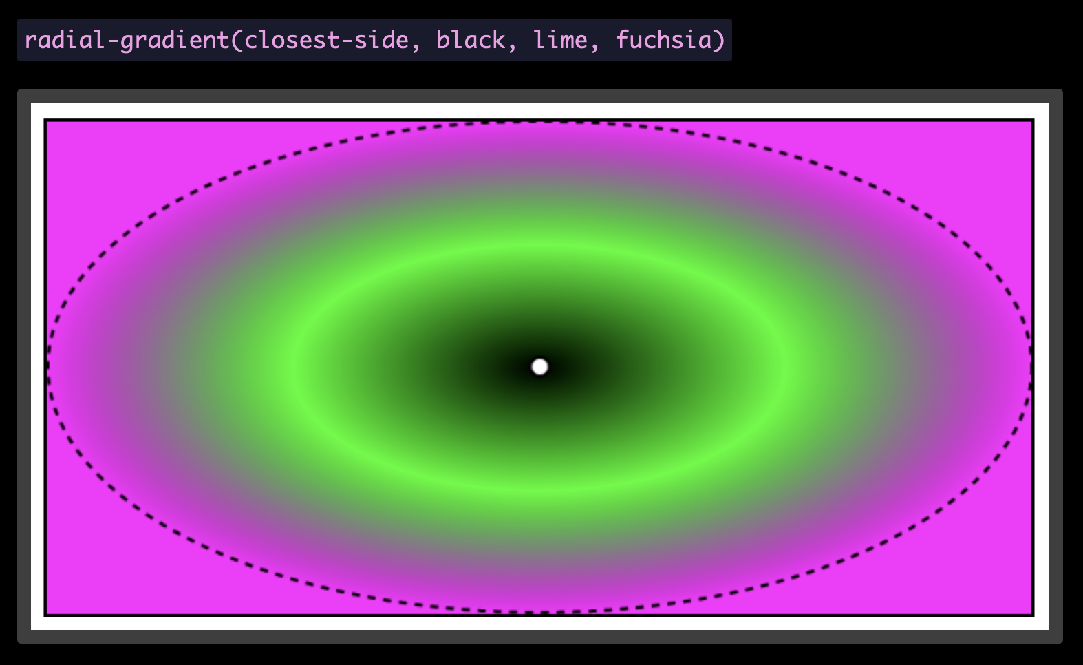
Some folks create stunning CSS gradient art. I'm none of them, but if you want to become part of the cook kids club, Patrick Brosset's guide covers everything you need to know about radial CSS gradients.
I learned that CSS can automatically size gradients with closest-side and farthest-side. 😲
I think about the following a lot! JSON APIs power the majority of sites I built today. And to use them, I have to run client-side JavaScript or do some serverless function magic. Unfortunately, it all becomes "a little tricky" to enhance things progressively.
But here's a thought: what if forms would support JSON? How great would that be!
You probably have used a
It's this mixed bag of absolute positioning, clip-path and white-space properties. Have you ever wondered why all this CSS is necessary? James Edwards explains it very well!
Learn what it takes to hide stuff visually
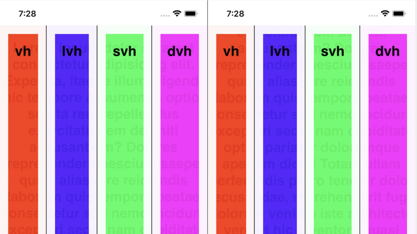
If you're using 100vh on your sites, consider switching to 100dvh. Manuel Matuzovic shares why.
Suppose you're looking for some inspiration on what fun things to build into your site. Max Böck curates a great collection of entertaining website functionality.
I've been writing a quick'n'dirty Node script, made a silly mistake and hit a surprise. Node just exited with the exit code 13. There was no error or anything. As it turns out, if you use Node's top-level await features, it comes with some additional DX sugar. 💯
Frontend tech is constantly moving, and it takes time to identify the new tech that matters. Tom MacWright collected trends you should keep an eye on.
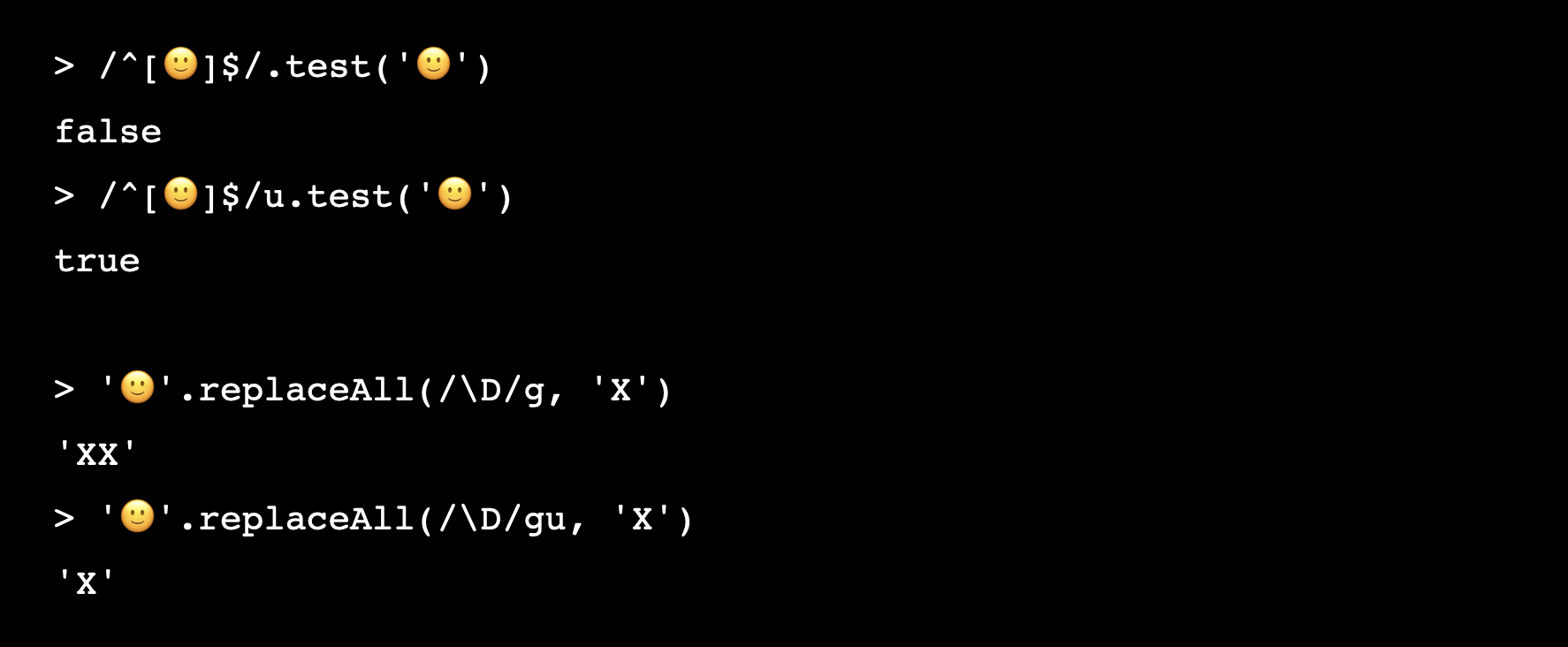
Apparently, there's a new Regex flag in the making — /v. There are so many Unicode facts in Axel Rauschmayer's post that it's hard to summarize.
If nerdy Unicode insights are your thing, you'll love this post.
From the unlimited knowledge archive called MDN...
Do you know that there's a fairly new :modal CSS pseudo-class? Now you do!
If you want to learn more about web development, my @randomMDN Twitter bot posts random MDN pages multiple times a day.
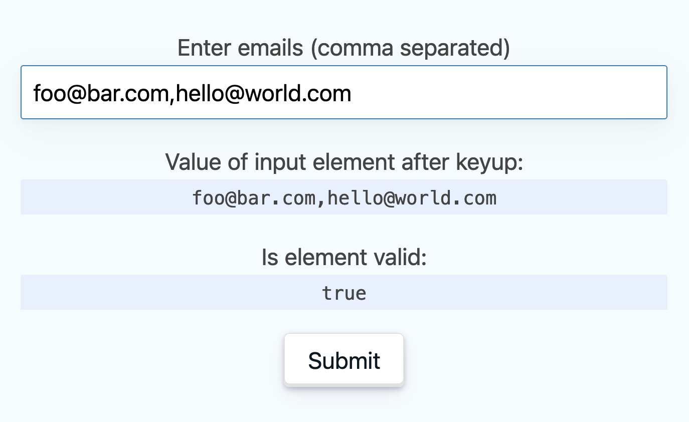
A while ago, I learned that email inputs support a multiple attribute. But before jumping all onto it, there are UX drawbacks.
Learn about email input challenges
Find more short web development learnings in my "Today I learned" section.
- google/wireit – Upgrade your npm scripts to make them smarter and more efficient.
- danielgatis/rembg – Rembg is a tool to remove image backgrounds.
- antfu/fsxx – File system scripts in
zxstyle.
I didn't know that clothoid corners were a thing, but if you always wanted them, this tool helps out.
Find more single-purpose online tools on tiny-helpers.dev.
There's a lot of truth in the following because the easy choices usually come with downsides.
Hard choices, easy life. Easy choices, hard life.
And that's why I'll do my Sunday evening exercise right after sending this newsletter. 💪 I hope...
I bought Nada Surf tickets for December, and I can't wait to see them live!
Writing Web Weekly takes me roughly five hours every week, and I pay real money for sending over 3.1k emails. If you enjoy it, consider supporting me on Patreon. ♥️
Or tell your friends about it:
- Share it on Twitter.
- Forward it to someone who might like it.
If you're not a subscriber, change that! 😉
And with that, take care of yourself - mentally, physically, and emotionally. I'll see you next time! 👋
Join 5.8k readers and learn something new every week with Web Weekly.
