Web Weekly #66
- Published at
- Updated at
- Reading time
- 7min
You might have noticed that I took a two-week break from Web Weekly. I just felt too exhausted with too many moving pieces in my life. But everything's on track again! 😊
I started building a proper landing page for this newsletter mainly to play around with Remix. It felt great that I didn't hit any blockers and could get rolling right away. The structure of Remix files reminds me of writing PHP back in the day, though. Is this web development repeating itself with another file extension?
I have a quick ask: do you see the testimonials section? I'd love to include more quotes in it. If you enjoy Web Weekly, it'd be great if you could share it online. Thank you!
And with this, today you'll learn about:
- named CSS grid lines
- site-specific browser controls
- situations when
divs are harmful
... and, as always, GitHub repositories, a new Tiny Helper and some music.
Lastly, welcome to the 54 new subscribers! I'm super excited to have you around! 👋
I discovered the @makemysoulhappy Twitter account, and I'm there for it!
- Executables starting with
git-are picked up as git commands. documenttriggers spellcheck..designMode = 'on' - TIL: Table cells support a
headersattribute.
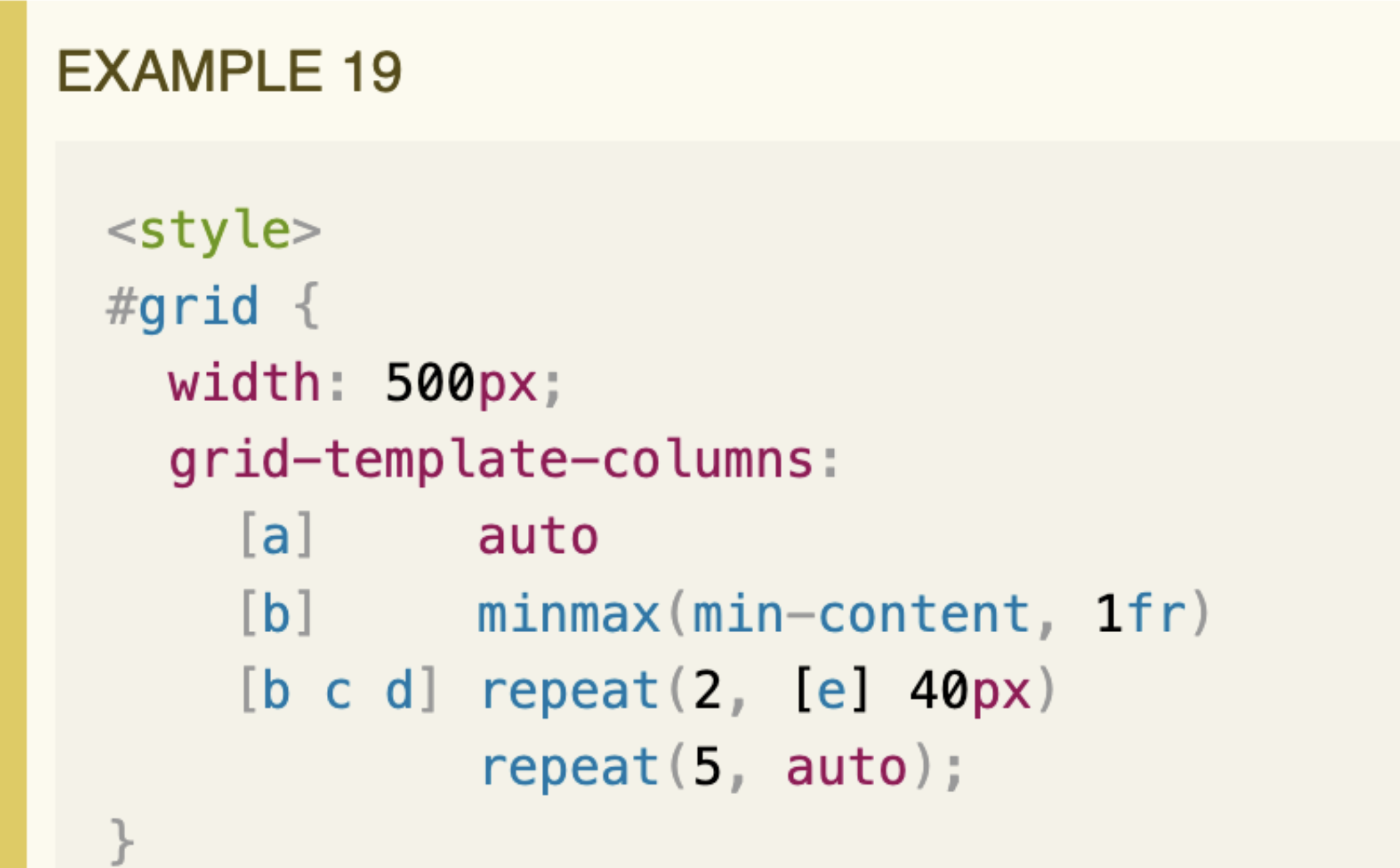
I found the above beauty in the CSS grid spec. 🤯 That's something, isn't it?
The snippet made me realize that you can define named grid lines in CSS.
I haven't had the time to watch all these Google I/O videos yet, but Paul published a nifty summary of good-to-know things.
The Twittersphere went wild about the new Shared Element Transitions API. I'll still treat it patiently because it's not the first time a solution to element or page transition has been proposed.
Nevertheless, good things are coming to the web lately!
This week I learned that IBM used to include a job interview stage to evaluate how folks behave in a team setting. Multiple candidates are put together in a room and tasked to solve something unsolvable.
The interviewers then check:
- Who's taking the lead?
- Who's a team player?
- Who's overwhelmed?
I have mixed feelings about this practice. But I know that I've been at such an interview myself once. It wasn't a group setting, and I didn't have to solve a puzzle, but the interviewer purposefully tried to annoy me testing my patience. I passed, and my new colleagues later told me the interview's purpose.
I doubt interviewees who failed the "patience test" were informed about the rejection reason. I think they should have. Having a lousy interview can put you off for days.
Anyways, if you have thoughts about this, I'd love to hear them!
Be aware of interview practices
With all these new browser APIs showing up, it's tough to keep track. APIs coming from Project Fugu aim to make it possible to write web apps that feel native without an Electron wrapper or similar tools.
If you want to learn what's possible today, the Fugu showcase lists many apps you can play with.
Discover all these Fugu projects
Jim published a super thought-through article arguing that browsers should offer a site-specific color scheme control. I strongly agree but I also think browsers should offer way more than that.
I shared my thoughts on the blog.
Are you as annoyed as I am when you discover that a website disables pinch-to-zoom? If I want to zoom on my phone, it's my business!
And yes, I'm looking at you, Twitter PWA!
I was delighted to learn that I can enforce pinch-to-zoom on my Android in Chrome and Firefox. A big thanks goes to Manuel for sharing this!
And here's Manuel again; I didn't realize that div elements can harm or break user experience. divs can mess with figure and details elements making them inaccessible for assistive technology. Today I learned!
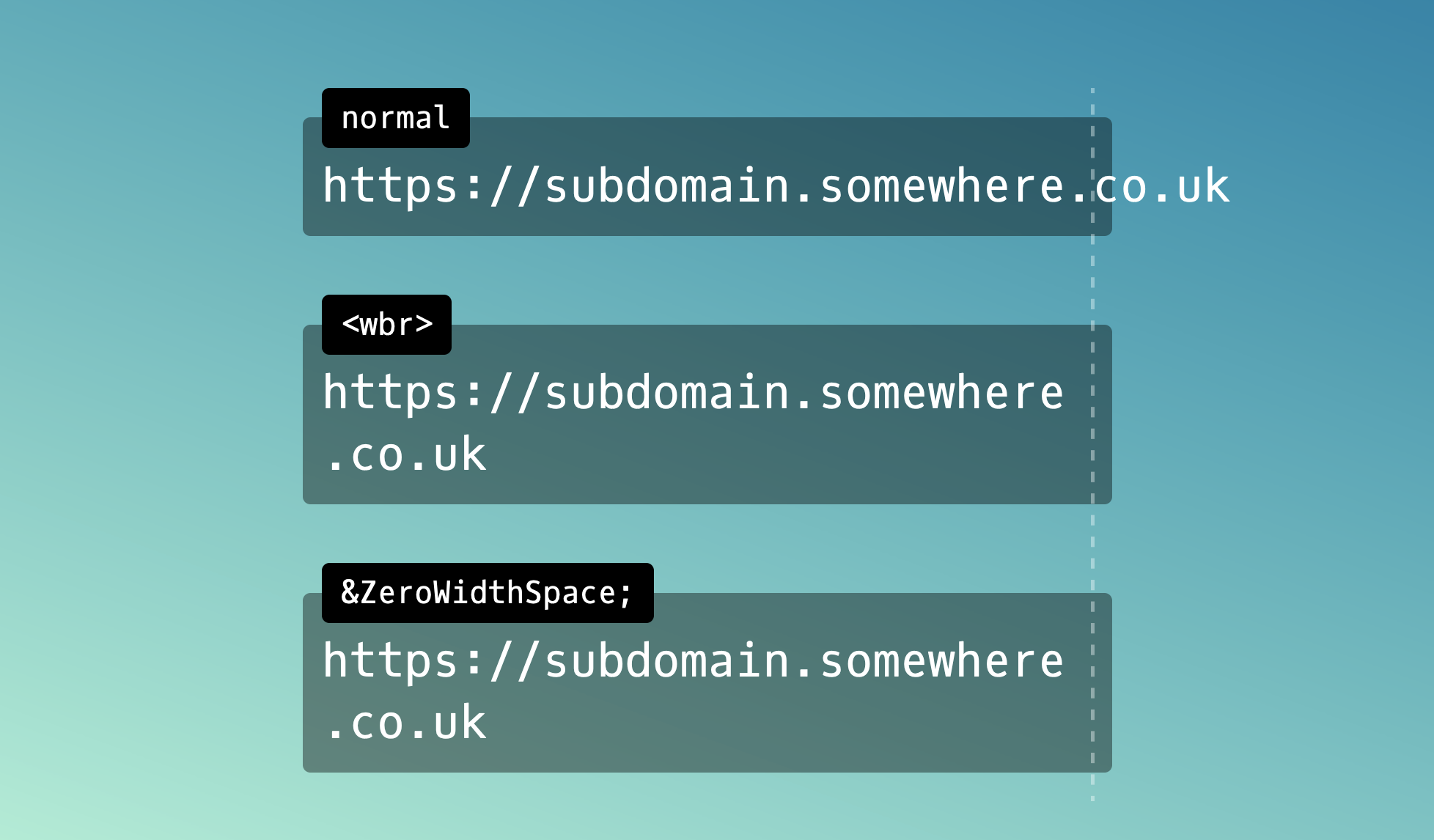
I have to admit I'm terribly confused by the CSS properties overflow-wrap, word-break and line-break. But after reading Will's post, I was finally able to fix some overflowing words on my blog. Thanks Will!
From the unlimited knowledge archive called MDN. How many ways exist to create a new CSS stacking context? There are more than ten! As usual, MDN has you covered to learn more.
Did you know that JavaScript arrays can have holes and, even wilder, that array methods like forEach just jump over the gaps? Now you do! 😉
Learn more about sparse arrays
If you learned something new, whether small or big, old or new, documented or not, I'd love to include more learnings in this newsletter. Send me an email, and I'm happy to share your discovery!
- johnwalley/allotment – A React component for resizable split views.
- kodepandai/awesome-gh-cli-extensions – An awesome list of github cli extensions.
- Cveinnt/LiveTerm – A terminal-styled website template.
If you're on the hunt for colorful CSS or SVG gradients, Color-Morph helps out. Choose a primary color and have countless gradient variations at your fingertips.
Find more single-purpose online tools on tiny-helpers.dev.
Kevin shared an extensive list of life advice. There are good entries in there. It's impressive that Kevin creates these posts once a year!
What you do on your bad days matters more than what you do on your good days.
This week's song is a slow indie track from 2005. I used to love the band Athlete. Their song "Chances" has everything that gives me goosebumps. There's a piano, strings and dramatic chorus. And I still love it! 💙
And that's a wrap for the sixty-sixth Web Weekly! If you enjoy this newsletter, I'd love you to tell others about it. ♥️
- Share it on Twitter.
- Forward it to someone who might like it.
If you're not a subscriber, you can change that! 😉
And with that, take care of yourselves, friends - mentally, physically, and emotionally. I'll see you next week! 👋
Join 6.2k readers and learn something new every week with Web Weekly.


![JavaScript code: let numbers = [ 1, 2, 3, 4 ]; delete numbers[ 1 ]; numbers.forEach((value, index) => console.log(value, index)); // 1, 0 // 3, 2 // 4, 3](https://images.ctfassets.net/f20lfrunubsq/2NZfVqybI9qJ4TUvJdvSMJ/2c7fe597164a3b883ac00ea1ebd4b841/Screen_Shot_2022-05-22_at_19.25.38.png)


