Web Weekly #141
- Published at
- Updated at
- Reading time
- 8min
Do you know how the LCP metric is calculated? Or when to use display: contents? Or do you wonder when we'll finally be able to style native select elements?
Turn on the Web Weekly tune and find all the answers below. Enjoy!
Dirk listens to "Black Coffee @ Salle Wagram in Paris, France for Cercle"
Black Coffee at this beautiful Salle Wagram in Paris. I like the smile on his face when he notices people getting into the flow.
Share your favorite song with the Web Weekly community! Right now there are no more songs left in the queue; hit reply, share your favorite tunes and keep the Web Weekly juke box going.
Let's open this week's Web Weekly with some "pretty wild hacks"...
First, here's a font that includes syntax highlighting.
How does it work? As I understand, the font includes all characters in multiple colors and then performs pattern matching to choose the correctly highlighted character. Wild!
Next off, you might know that you can't overwrite !important styles coming from the user-agent stylesheet. But what if you really want to?
Noah figured out that you could set transitions with CSS infinity. 🤯
And lastly, Bramus released a new library to detect CSS property changes.
But how can he detect when a CSS property changes? He used a creative combination of CSS transitions and the fairly new transition-behavior: allow-discrete;. Wow!
I'm no meme person, but this one made me chuckle...
And yes, I do touch my screen when I'm stuck on the macOS update dialog. 😅
The meme is from a surprisingly good post describing how to create good progress indicators.
- I learned a new AI term — AI fog.
- TIL — How to edit long terminal commands in your favorite editor.
- TypeScript 5.6 is out.
Dave collected thirty points describing what makes a good form.
The point mentioning navigator is interesting. Do you check if the browser's online before submitting data?
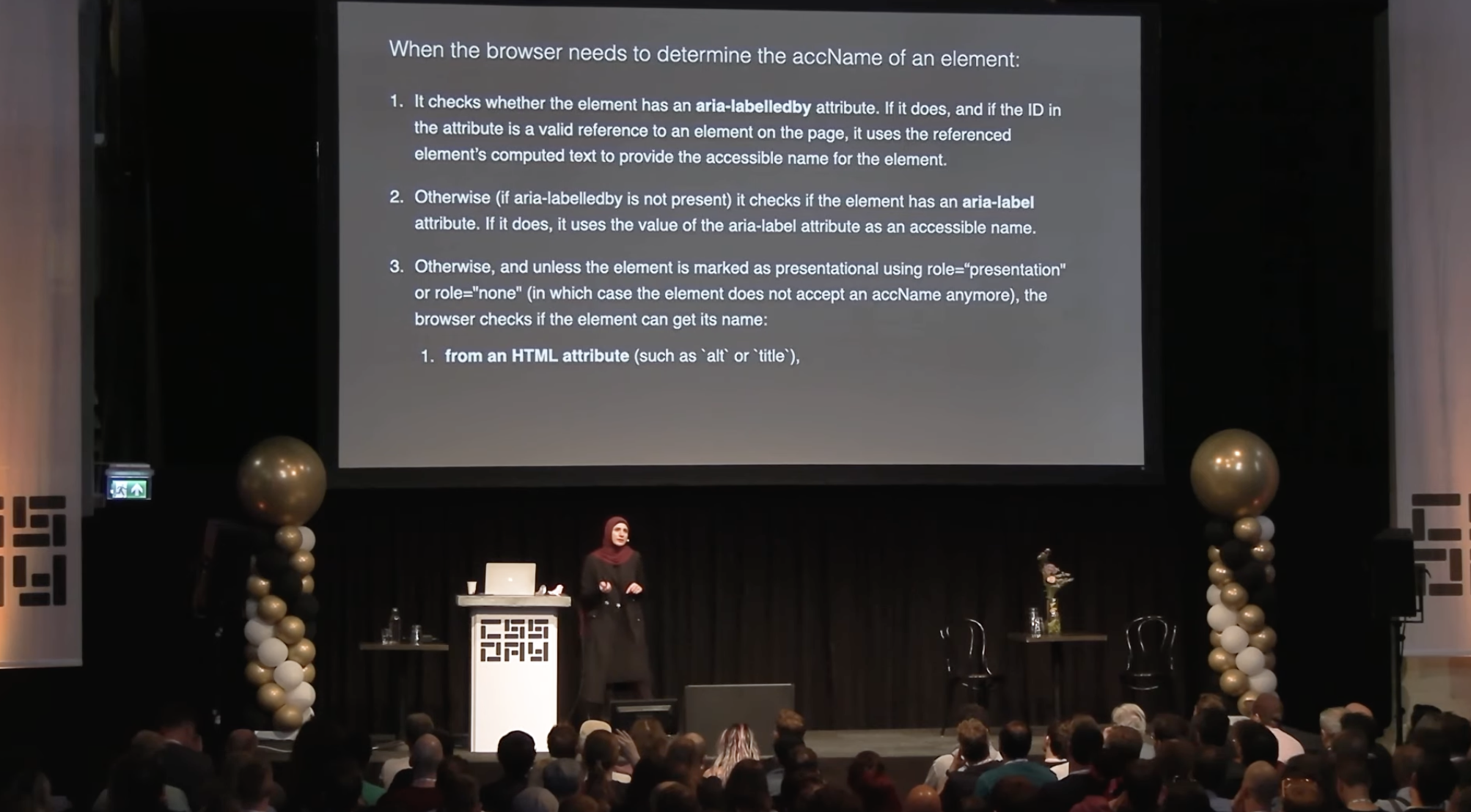
Sara gave a talk about CSS and accessibility, and she does what she does best: delivering a presentation packed with valuable insights! Highly recommended.
I summarized what I learned about accessible name computation on the blog.

Now, this is a great-lookin' button, isn't it? Ryan used backgrounds and @property animation magic to build it. And now that @property is cross-browser supported, I'll keep this post around for my next blog redesign.
Oldie but goldie: now that we're all optimizing for Google's Core Web Vitals (LCP, INP and CLS), did you ever question how the largest contentful paint metric is calculated? For example, do you know there's a bits per pixel threshold an image has to pass to count as an LCP element? Tim shared very nerdy details on how the LCP metric works.
And speaking of core web vitals, Chrome officially discontinued the first input delay metric.
Wowza! Would you enjoy getting Web Weekly straight to your inbox?
The WWW (wonderful weird web) section usually includes odd internet discoveries, but this time, it's tech-related. The fine people at Stripe released a new developer portal, and oh boy...
This page is supposed to provide links to additional resources and yet comes with a built-in terminal, music, animations... It's beautifully weird!
Make sure to check the subgrid usage and play with the embedded console.
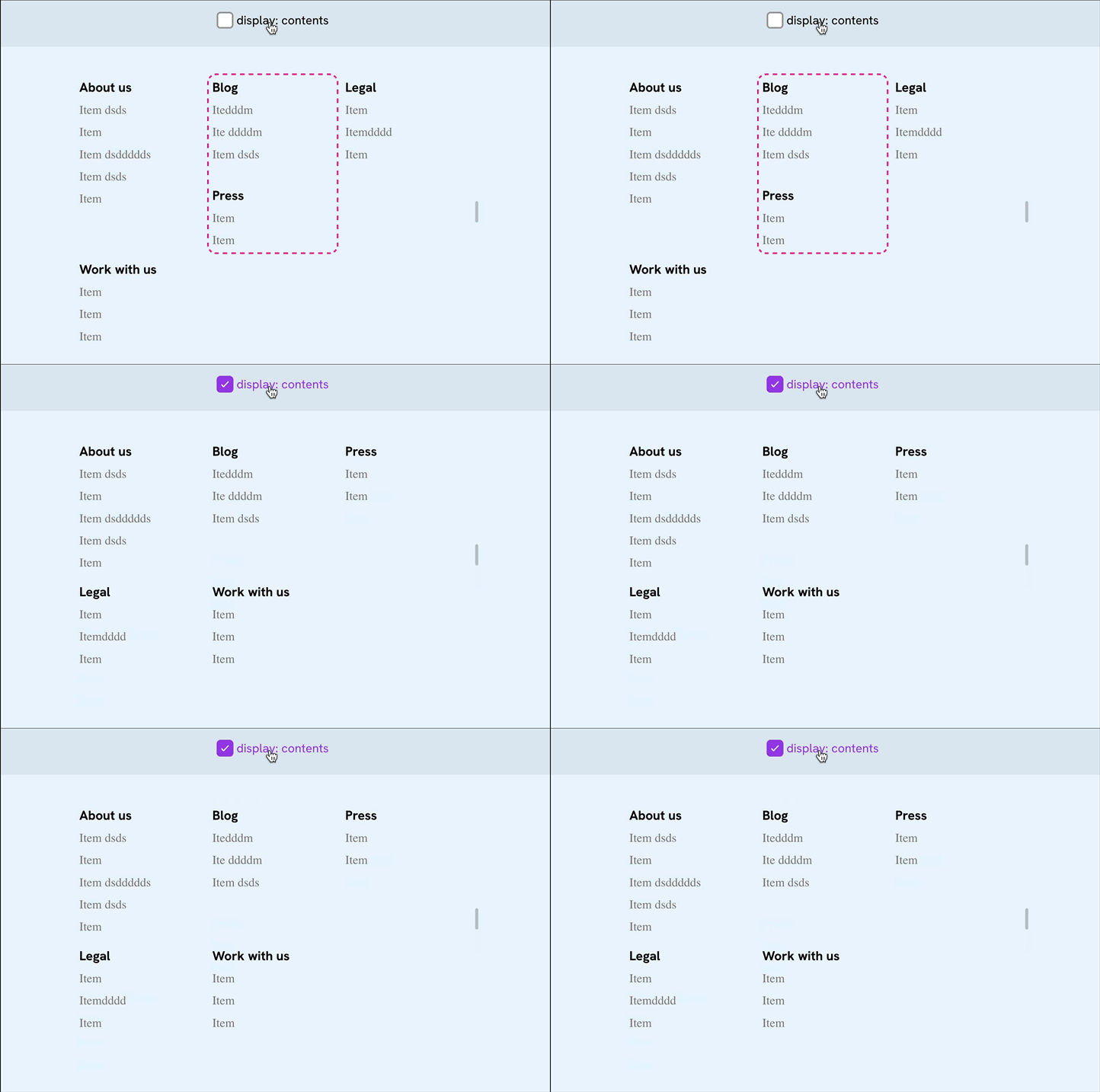
Do you use display: contents? I haven't used it, mainly because of its bad press. It's known to include plenty of accessibility issues.
But what if you set it on generic wrapper elements? Ahmad explained how the display property helps to shuffle columns around.
If you're curious about the current affairs of display: contents and if it is safe to use in terms of accessibility, here's Adrian with a reaction:
Do not use display: contents on anything that can take focus or is interactive. Probably avoid it on things with richer semantics (such as tables and lists and headings and so on).
Summary: for wrapper divs it should be fine. 💪
Years ago, there was this one post showing what actions browsers will perform (layout, paint, composit) when you update a CSS property.
There's now a new community-led collection listing all the properties and Andrico is looking for help getting all the data up to date.
What's an HTML paragraph? Easy question, right? Here's what the spec says:
The term paragraph [...] is used for more than just the definition of the p element.
Are lists are also considered paragraphs? Yep. Does this also apply to div or span elements? Double yep.
If you're now like, "WHAT!?", yes — I felt the same...
Centering elements in CSS is a solved problem. And now, with align-content working on block elements, it even got a bit easier.
"Can I use" says there's 80% global support for block-level align-content. So, if your support level is modern browsers, you could start using it.🤞
And if you're running into issues of inline elements not being perfectly centered, Temani helps out.
From the unlimited MDN knowledge archive...
Do you know there's a VisualViewport API that's supported in all browsers? Now you do!
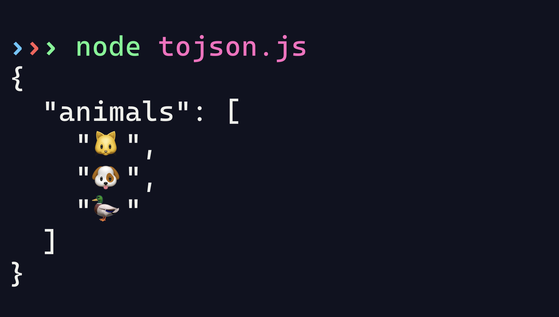
Fun fact: JSON checks for a toJSON method before serializing an object. The built-in functionality can be helpful when serializing complex objects.
Find more short web development learnings in my "Today I learned" section.
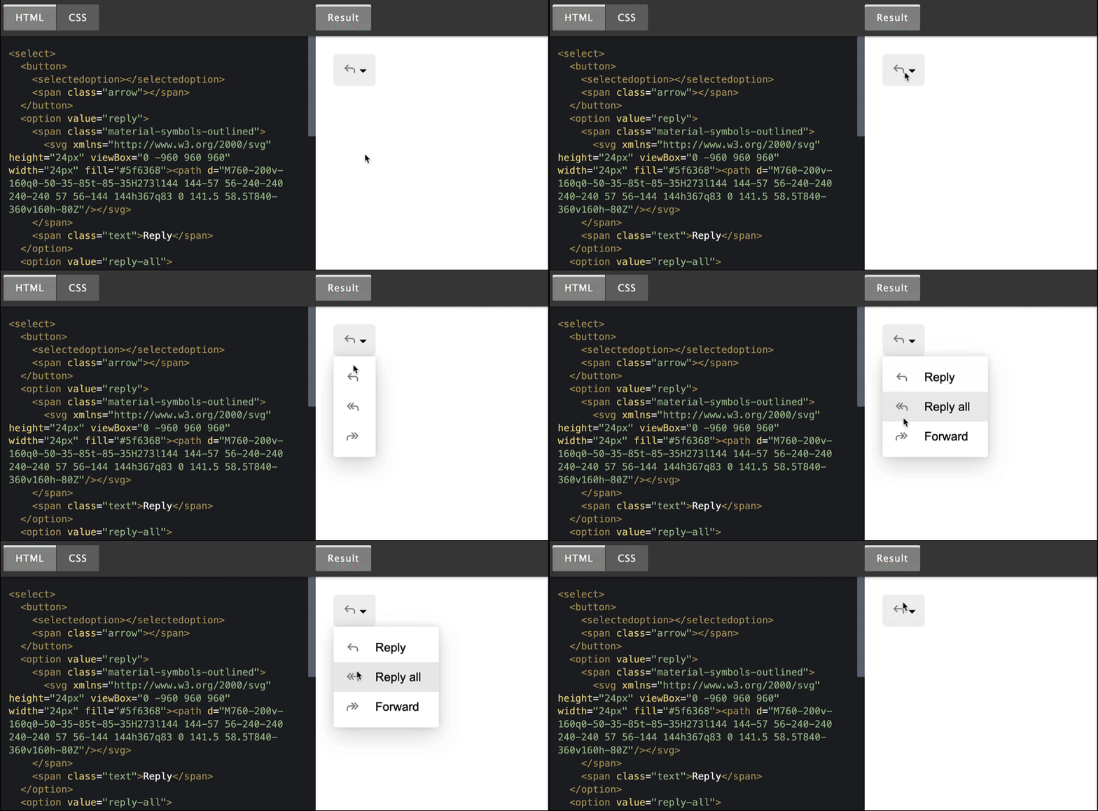
I've still a long list of things that entered the web recently, but this week, the Chrome team shared that there's news on the "HTML/CSS-only styleable select" front.
The following only works in Chrome Canary, but the other browsers are interested in implementing this proposal.
Get your daily dose of tech & science news, must-read articles, interesting GitHub repositories, and big Tech failures - all packed into a 15-minute read 👉 Join 0xCAFE!
- es-tooling/eslint-plugin-depend – An ESLint plugin suggesting dependency optimizations.
- sxyazi/yazi – Blazing fast terminal file manager written in Rust.
- srcbookdev/srcbook – A TypeScript notebook for rapid prototyping.
If you're waiting for an API endpoint to implement, this API mocking helper is golden. Define your responses, call it and get rollin'!
Find more single-purpose online tools on tiny-helpers.dev.
Alex Russel is again not holding back about the current state of web affairs.
Unacceptable performance is the consequence of a chain of failures to put the user first.
💙 If so, join 14 other Web Weekly readers and support Web Weekly with a small donation on Patreon or GitHub Sponsors.
Loved this email? Hated this email? I want to hear about it!
If you think something needs improvement or something sparked some joy, reply to this email because I want to know more!
And with that, take care of yourself - mentally, physically, and emotionally.
I'll see you next week! 👋
Join 5.9k readers and learn something new every week with Web Weekly.


