Web Weekly #127
- Published at
- Updated at
- Reading time
- 8min
How could you use the new CSS @scope to create encapsulated component styles? What does the quotes CSS property do? And when would you use the never TypeScript type?
Turn on the Web Weekly tune and find all the answers below. Enjoy!
Christian listens to "DOMi & JD BECK, Anderson .Paak - TAKE A CHANCE" and says:
This song is a combination of some of my favorite music nerds, it just makes me happy.
Do you want to share your favorite song with the Web Weekly community? Hit reply; there's only one more song left in the queue.
Happy CSS Naked Day! Happy what?
Let me share the idea of this web holiday.
The idea behind CSS Naked Day is to promote web standards. Plain and simple. This includes proper use of HTML, semantic markup, a good hierarchy structure, and of course, a good old play on words. In the words of 2006, it’s time to show off your "body" for what it really is.
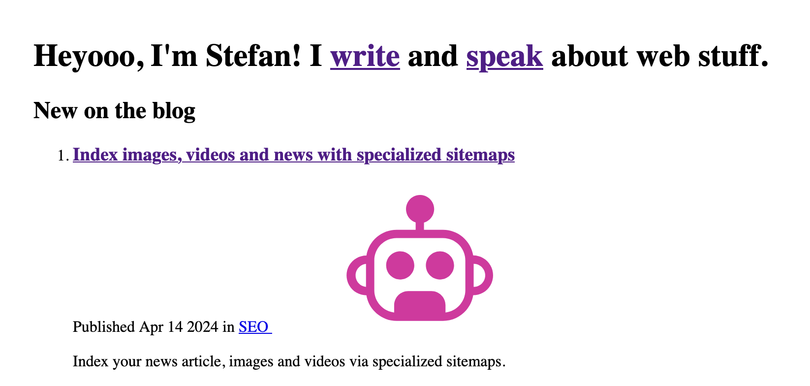
I love this idea. Unfortunately, I missed to participate. But hey, I'm all for promoting web standards. How does my site look without CSS, then?
Ouch! Some SVGs are missing width and height attributes. Otherwise, the site looks okay. Semantic HTML for the win!
If you don't know how to turn off the styles, for my site, I opened devtools, found the one and only style element, and hit delete.
How would you do it for sites with multiple stylesheets, though? Maybe you also want to toggle specific sheets on and off to debug CSS class collisions. Some browsers have UI for this task, and the DevTools Tips list them all.
What does your naked site look like?
- Google released a new JPEG codec - jgepli.
- HTML emails include an obvious (and well-known) security flaw.
- TIL — PDFs can run JavaScript.
Bramus is onto something close to my heart. For years, I've secretly advocated for additional and more accessible site settings. What do I mean by that?
I believe that browsers should provide interfaces to control each site's experience. As a developer, I have so many CSS media queries to react to user preferences (prefers-reduced-motion, prefers-contrast, ...), but normal people don't know about them, and the settings aren't easy to control. And most annoyingly, I can't control these settings per-site.
For example, I rarely get motion sickness, but some sites overdo it with parallaxing. Wouldn't be great if I could open a settings dialog and turn off movements for this one site? 100%.
And isn't it wild that we all implement custom dark mode toggles to remember a visitor's preference? It's a nice coding exercise, but isn't this all wasted effort?
Browsers should solve these problems for us, and Bramus is pushing this idea forward with a working prototype. 👏
This React tutorial explains how to animate a progress element and becomes an excellent read after introducing the useTransition React hook. (TIL!)
If you're writing React, this post is worth it!
Two more days, and it's another big day for the web. On April 16, Firefox 125 will ship, and with it, the new popover features will enter mainstream. The popover and popovertarget attributes are ready to rumble soon!
If you're looking for some base styles to get the most out of your new popovers, Adam was so kind to do the hard work for us.
The code uses @starting-style, which doesn't work in Firefox yet but can be treated as progressive enhancement.
Let's assume the internet won't collapse under all this AI-generated content, and search engines will still play a role in the future. 😅
This week I learned that you can point Google to specialized sitemaps for images, videos and news.
Wowza! Would you enjoy getting Web Weekly straight to your inbox?
Please disperse. There's nothing to see here. It's only a game in which you have to throw a bag of poo into the trash bin.
What a sentence to write...
What are your favorite internet corners? Send them my way, and I'll include them in Web Weekly!
You might have heard of Igalia. Igalia is a company working on browser engines. According to Brian Kardell, they started working on bringing the Trusted Types API to Firefox and Safari.
Why's this cool? Trusted Types will limit dangerous API access (think of users injecting evil JavaScript via innerHTML) by a reasonable amount. If you want to learn how they work, Brian has you covered.
Have you looked into CSS @scope yet?
It's okay. Full browser support isn't there yet with Chromium 118+, Safari 17.4, and no Firefox support.
But I'm excited about it. Not only does CSS scoping include roots and limits (@scope (), it also has built-in HTML style encapsulation. I can't wait to include scoped inline styles in my blog's demo components.
If you want to learn more about using CSS scoping, Robin's newsletter covers how to break the cascade for components!
When should you use the never type in TypeScript? If you know when, are you sure you're using never correctly? Stefan Baumgartner explains why many people use never incorrectly.
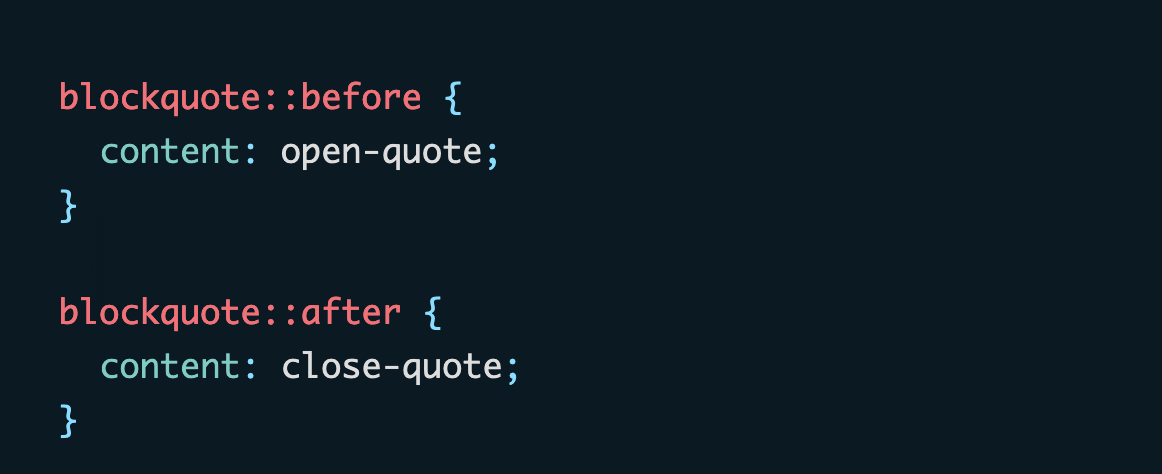
Do you know that different languages use different quotation characters? In Germany, we use these friends: „ “. Our neighbors, the French, use these: « ». How could you display the correct quotes?
Easy peasy — just let CSS do its job.
From the unlimited MDN knowledge archive...
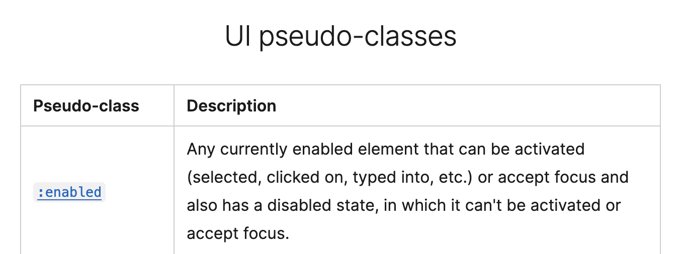
Real talk: How many pseudo-classes could we add to an input element? As always, MDN has all the answers.
Let's say you have an ordered list going from 1 to 5. Then there's a paragraph. And then, you want to continue your list starting at 6. How do you do that?
The answer: use good old HTML.
Find more short web development learnings in my "Today I learned" section.
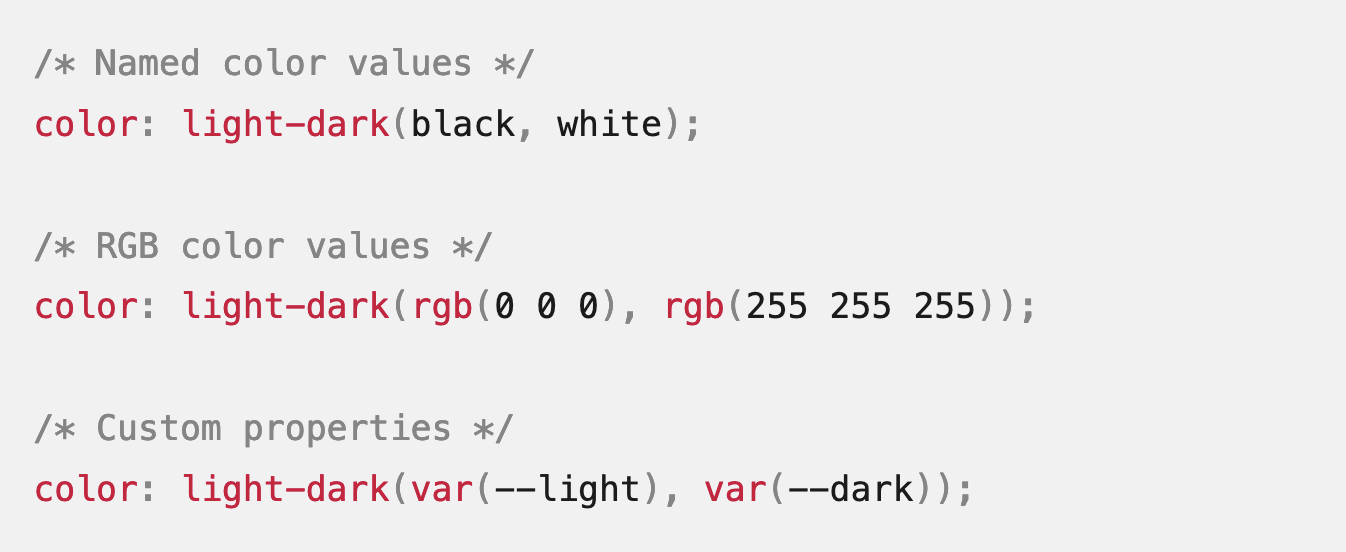
Are you tired of typing lengthy dark mode media queries? If so, there's a new CSS function in town — light-dark.
- BuilderIO/partytown – Run third-party scripts off of the main thread in a web worker.
- altsem/gitu – A TUI Git client.
- denisidoro/navi – An interactive cheatsheet tool for the command-line.
If you care about performance (and why wouldn't you?), you know web fonts are classic layout shift offenders. To avoid jumpy text, you should opt for local fonts whenever possible.
Modern Font Stack lists them all and lets you preview how these fonts will look in a demo article.
Find more single-purpose online tools on tiny-helpers.dev.
If you don't have a website because you're unsure what to put there, here are some wise words from Ana Rodrigues.
You don't have to be a content creator to have a website.
Go and claim your internet corner; it's worth it!
Loved this email? Hated this email? I want to hear about it!
If you think there’s something that needs to be improved or something that you enjoyed, reply to this email because I want to know more!
And with that, take care of yourself - mentally, physically, and emotionally.
I'll see you next week! 👋
Join 5.9k readers and learn something new every week with Web Weekly.
