Web Weekly #126
- Published at
- Updated at
- Reading time
- 9min
When will align-content work in divs? Does the new popover attribute improve accessibility? And why does margin: auto work on absolutely positioned elements?
Turn on the Web Weekly tune and find all the answers below. Enjoy!
But before, the Web Weekly music queue is almost empty. If you enjoy discovering and sharing new music, send me your favorite tracks to keep the Web Weekly jukebox playing.
Ellen listens to "Slut — If I had a heart" and says:
"If I Had a Heart" creates an aura full of melancholy and a unique atmosphere, as if the song itself was my heartbeat. Would it sing or cry?
How many Git commands do you use regularly? I'm the add -p, commit, push'n'pull kinda guy. I might even be able to perform a fancy rebase now and then. But do I know what I'm doing? Not really.
How can you level up your Git skills?
The following talk series is a trick rapid-fire. The videos have jump marks so you can pick your topics. Highly recommended.
Additionally, Julia Evans started digging into Git. As always, her articles are approachable yet super informative.
What are your favorite Git resources?
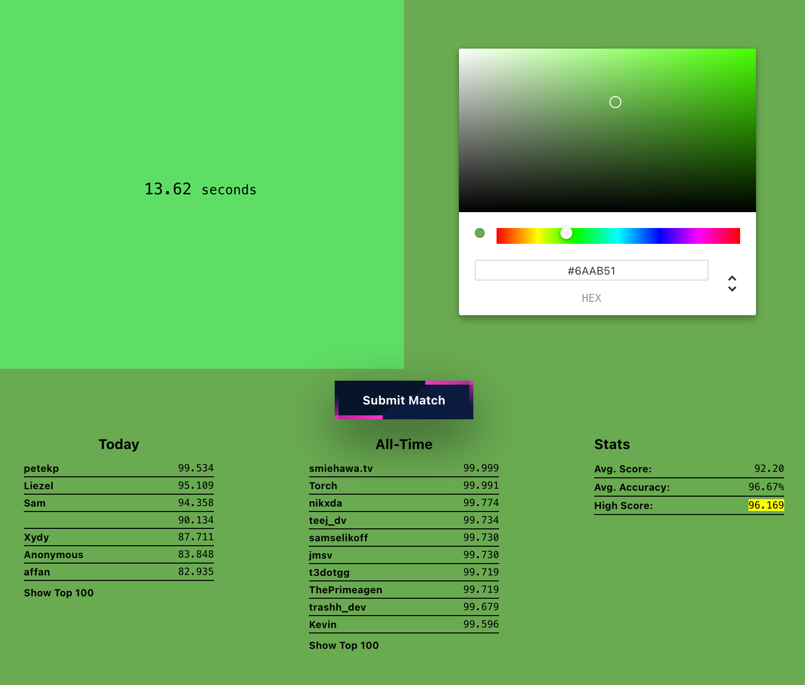
How good are your eyes (or monitor) when differentiating colors? Find out with colormatch.
- Experimental support for
require()ing ES modules landed in Node. - A quick reminder of why you should encode your HTML attribute values.
- With all these new JS runtimes, here's an overview of what language features they support.
- WebAIM's new report on the accessibility of the top 1,000,000 home pages is out.
- I added a new new
git yolocommand to my setup.
How do you extend your Frontend components and make them configurable? Easy — slap an is-active or h-full class onto it and call it a day, right?
But the more class modifiers you add to your components, the trickier it gets. It's one of these problems that becomes harder with every change. Component and design system design is tough.
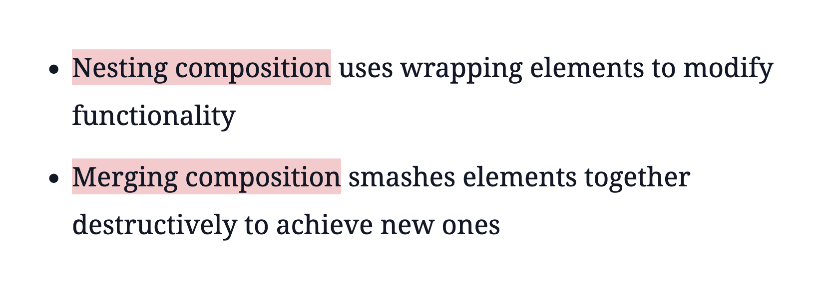
Kyle Shevlin's post on component compositions triggered some thoughts, and I think I changed my approach to component creation now.
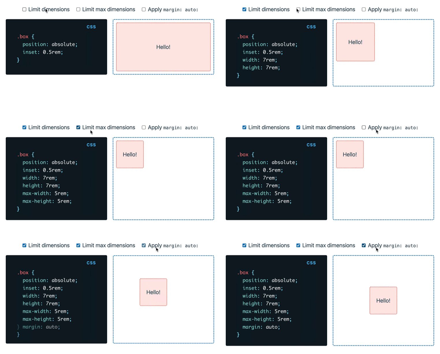
It can't just be me who hasn't applied margin: auto to absolute positioned elements before, can it? I learned this week that you can center elements (X and Y axis) with a smart combination of inset, width and margin.
Short'n'sweet: Kitty Giraudel published a straightforward recommendation on when to use readonly, disabled and aria-disabeld.
Wowza! Would you enjoy getting Web Weekly straight to your inbox?
The Grumpy website complains about what's wrong with the web today. We're talking weird dialogs, cluttered UIs, unlogical user flows, unreachable footers, [PLACE YOUR WEB ANNOYANCE HERE]...
Let's stand up and yell "YES! This annoys me, too!" together!
What are your favorite internet corners? Send them my way, and I'll include them in Web Weekly!
While it won't be released anytime soon, React will eventually transform into a compiled Framework. If you think this sounds like a drastic change, it is. Nadia Makarevich does a great job summarizing what's on the horizon.
What could change with the React compiler?
Heather Buchel reflects and shares lessons learned when advocating for an accessible web. It's a fantastic read!
Understand why it's tough to advocate for accessibility
What happens if your HTML content includes an ordered list with over a thousand entries? Correct! The use agent styles start to break, and the list markers will overflow.
It's wild how inflexible the default styles are in this area, but Noah Liebman shared how to solve this issue with a fancy subgrid!
Have you ever discovered how difficult mixing and matching different fonts in a paragraph is? It's surprising how challenging it is to align different fonts and make them equal in size.
Theoretically, font-size-adjust solves this problem, but browser support is still lacking. Com'on Chromium!
Rasmus Fløe shared how you can still align all these different fonts with some font analysis.
Someone should build a quick tool to align fonts automatically. If that's you, let me know!
On the bright side, popover cross-browser support is just around the corner. Chromium has shipped the new attributes since 114, Safari has supported them since 17, and Firefox includes the new UI features in the nightly channel.
But what do the popover and popovertarget attributes mean for accessibility? Hidde de Vries and Scott O’Hara went deep into this topic.
tl;dr
aria-expandedstate is handled automatically.aria-detailsis sometimes applied.role="group"is sometimes applied.- focus handling is built-in.
From the unlimited MDN knowledge archive...
Have you used the dfn HTML element? Maybe you should give it a try.
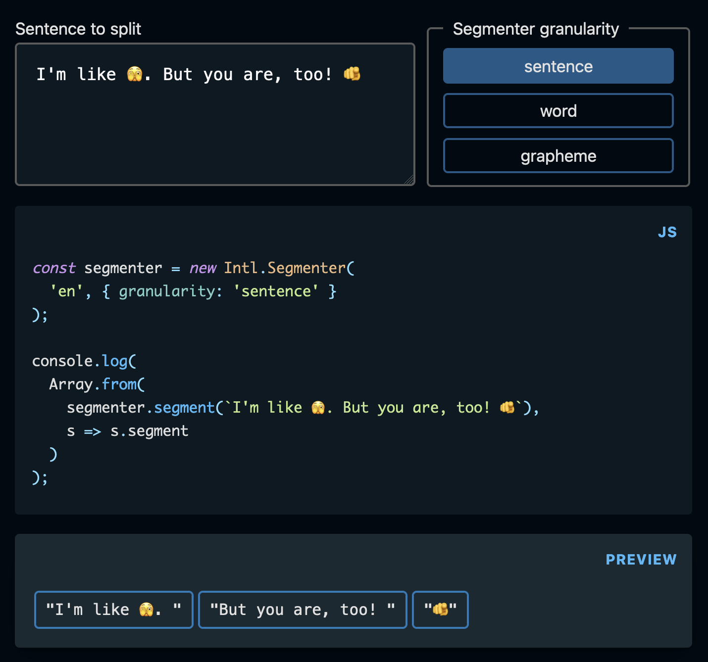
Intl reaches cross-browser support with Firefox 125 (shipping on April 16). Then, we'll have a native way to split strings into words, sentences, and even graphemes.
Find more short web development learnings in my "Today I learned" section.
With Safari 17.4, vertical form controls are available on the web. How can you flip the controls? A writing-mode: vertical-rl; does the trick! Neat.
Unfortunately, I can't read a top-to-bottom language, so I don't see myself using vertical textareas, inputs or selects soon. But a vertical range slider or progress indicator — I'm game!
The support info for vertical form elements isn't ready on MDN, but I checked <input type=range> and <progress> in the current Chrome, Firefox and Safari Tech Preview. The two worked fine.
But in other news, when it comes to centering elements in block layouts via align-content, MDN compat has all the data.🎉
And as you see above, we're almost there. Centering elements in a div becomes a fancy CSS one-liner soon!
- antonmedv/fx – Terminal JSON viewer & processor.
- mcollina/borp –
node:testrunner wrapper with TypeScript support. - slidevjs/slidev – Presentation Slides for Developers.
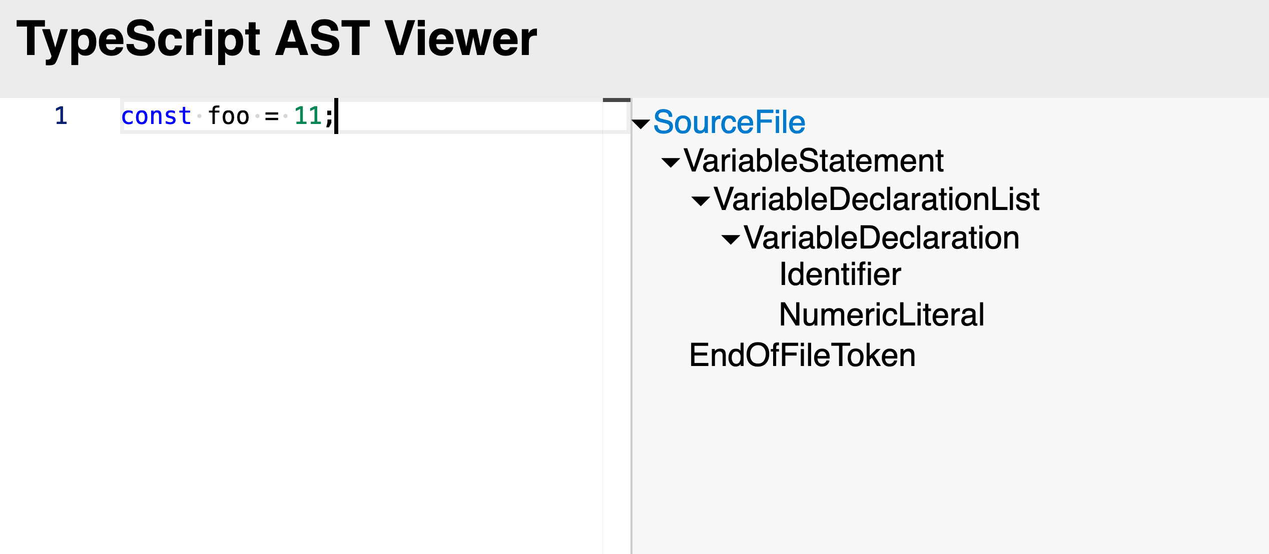
For the TS nerds: the TS AST viewer helps you understand how the TypeScript compiler parses your beautiful code.
Find more single-purpose online tools on tiny-helpers.dev.
Reminder: don't use underlines when designing documents, sites, slides, or anything that can be consumed with a digital device. 😅
Underlining basically only exists now to confuse people into thinking something is a link that they can click on.
Anil Dash has some more solid advice in "Make better documents".
If you want to support this newsletter, recommend it to your friends, book a sponsorship package or ensure that I'm not running low on coffee with a small donation.
Thank you! 💙
And with that, take care of yourself - mentally, physically, and emotionally.
I'll see you next week! 👋
Join 6.2k readers and learn something new every week with Web Weekly.

