Web Weekly #115
- Published at
- Updated at
- Reading time
- 8min
How does Google do site reliability engineering? Is using relative CSS units (rem) to control spaces like margins and paddings a good idea? Are you ready to adopt native and relaxed CSS nesting?
This week's Web Weekly includes all the answers and much more. Enjoy!
I heard having your own font is important for successful tech companies these days. Vercel followed the playbook and released Geist.
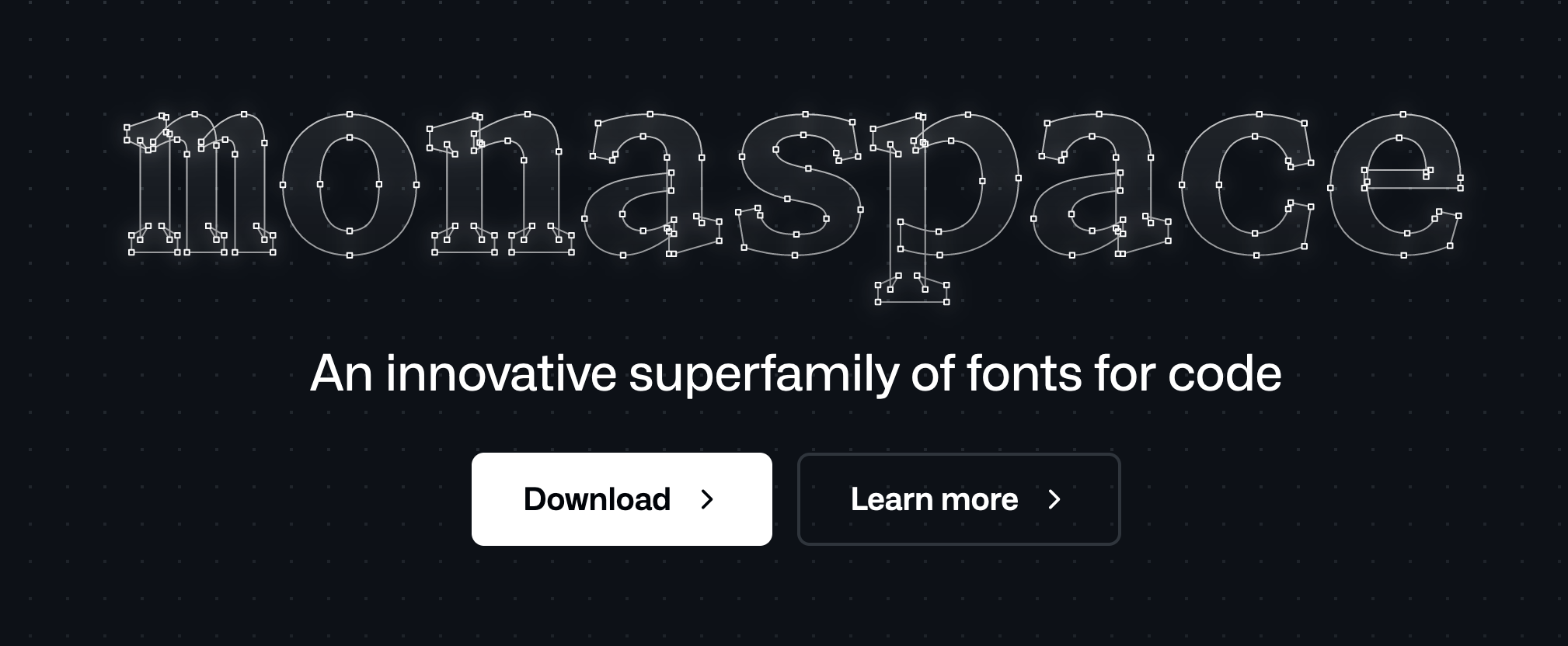
Shortly after, GitHub followed. But the Octocat maintainers didn't release yet another standard coding font, but rather an entire font family — say hello to "Monaspace".
Monaspace is a set of five variable fonts supporting the same font axes. I haven't tried it yet, but theoretically, you could mix and match the fonts, and they'll stay on the same grid. Sweet!
And I must say, I'm inclined to try Krypton on the blog because it looks nicely out of space. The fonts also support ligatures if you want to be super fancy.
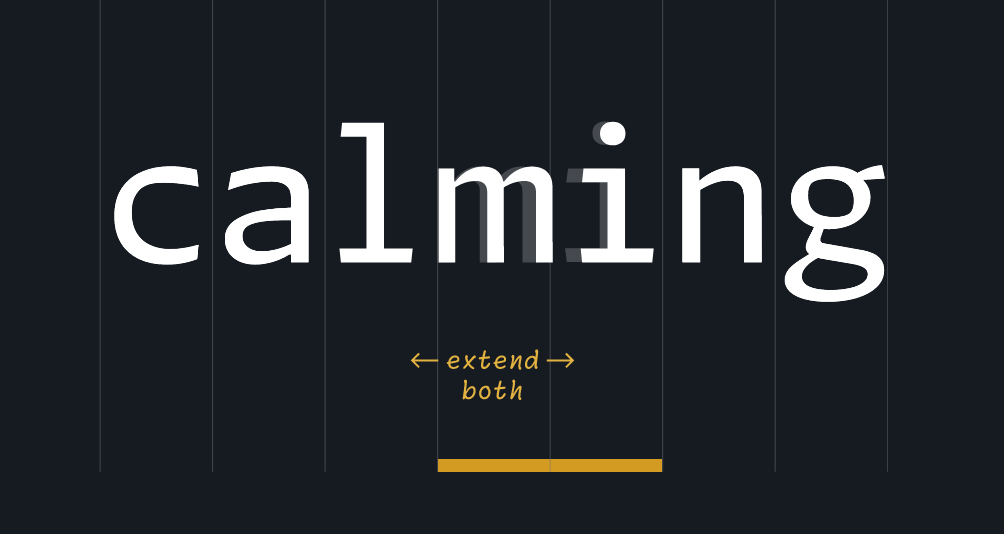
But monospace fonts usually have some visual problems. The i often is too wide. The m looks squished. It's unfortunate, but that's how it has to be — it's monospace after all, right?
Monaspace comes with a new font feature called texture healing. Texture healing works against putting every character into the same-sized box and expands/narrows characters while keeping the text monospaced. Very funky!
I'll try the fonts in my VS Code setup and see if texture healing is nicer on the eyes.
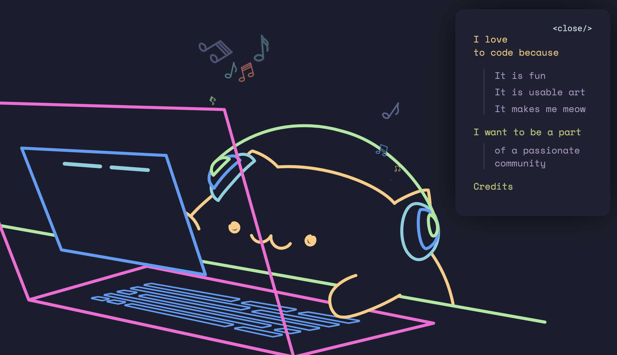
Please disperse; there's nothing to see here. It's just a cat being up for pair programming.
- Do you give presentations? If so,
deckis a collection of beautifully designed decks to spark inspiration..gallery - Firefox ships a new accessibility feature to enforce link underlines.
- New on the blog: Too small touch targets.
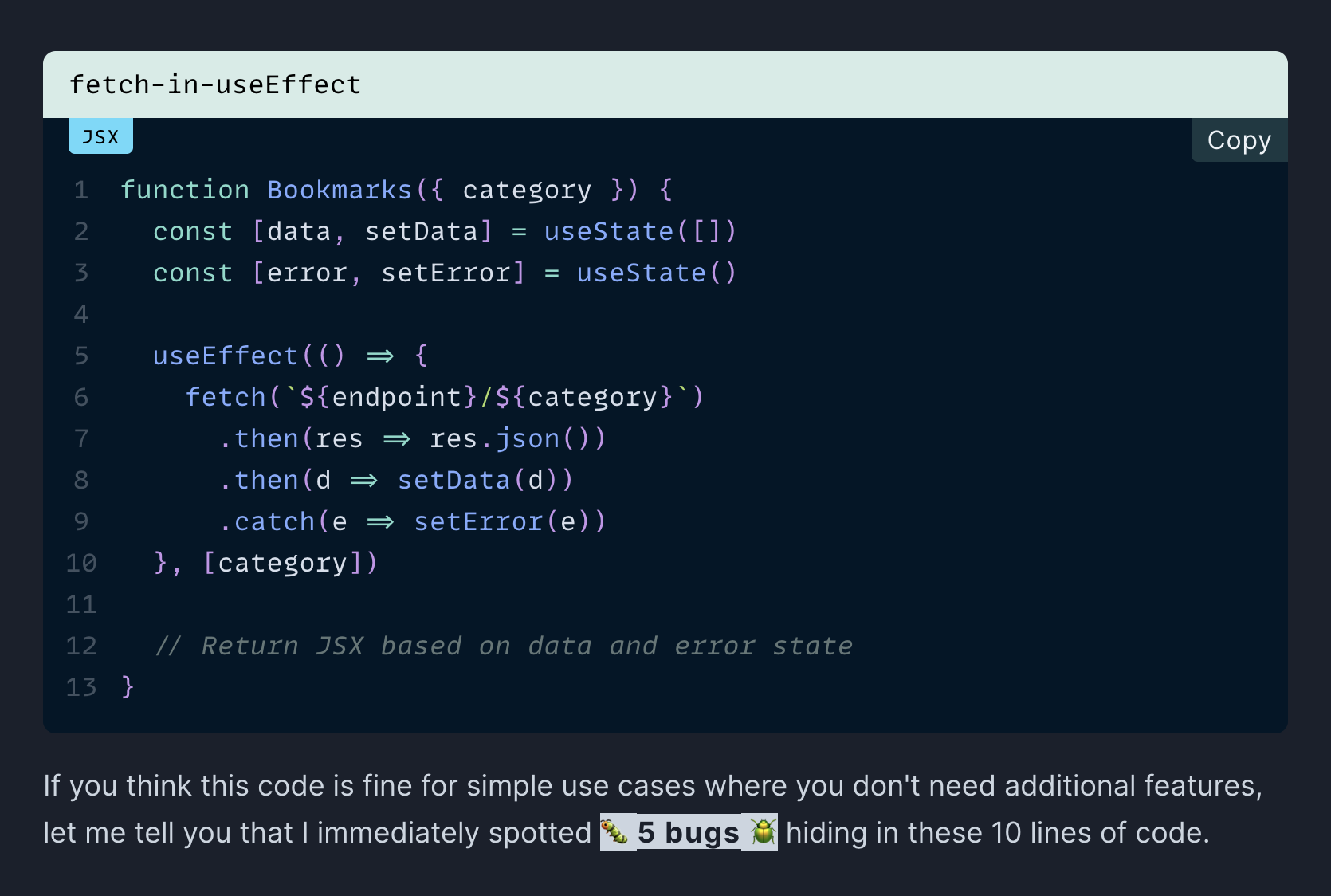
Apparently, the React docs advise using a library to fetch data in your components. Why is that? Isn't it straightforward to call fetch in a useEffect hook? Well... no. And Dominik explains how the quick'n'easy useEffect approach leads to subtle bugs.
Even though site reliability engineering isn't in my ballpark, I enjoyed the lessons learned while scaling projects at Google.
Did you know there are other ways to disable a form element than setting the disabled attribute? Šime Vidas explains why the :disabled and [disabled] CSS selectors can match different elements.
Using relative font sizes (rem) instead of pixel-based ones is a good idea because they allow users to control a site's font size via their browser settings. If someone wants to increase the overall font size, our CSS should accept this.
This practice works well on desktop, but the mobile space is less predictable. Manuel Matuzović tested how mobile browsers treat rem units, and well...
The relative font size handling on mobile is more than messy.
And after discovering that rem units behave inconsistently, Ashlee M Boyer came along to share that using relative units for spacing is a bad idea. I must admit I've never thought about the points she makes, but she's onto something here.
I didn't encounter any weird web corners this week. Can you help me out for next week? What are your favorite internet corners? Send them my way, and I'll include them in Web Weekly!
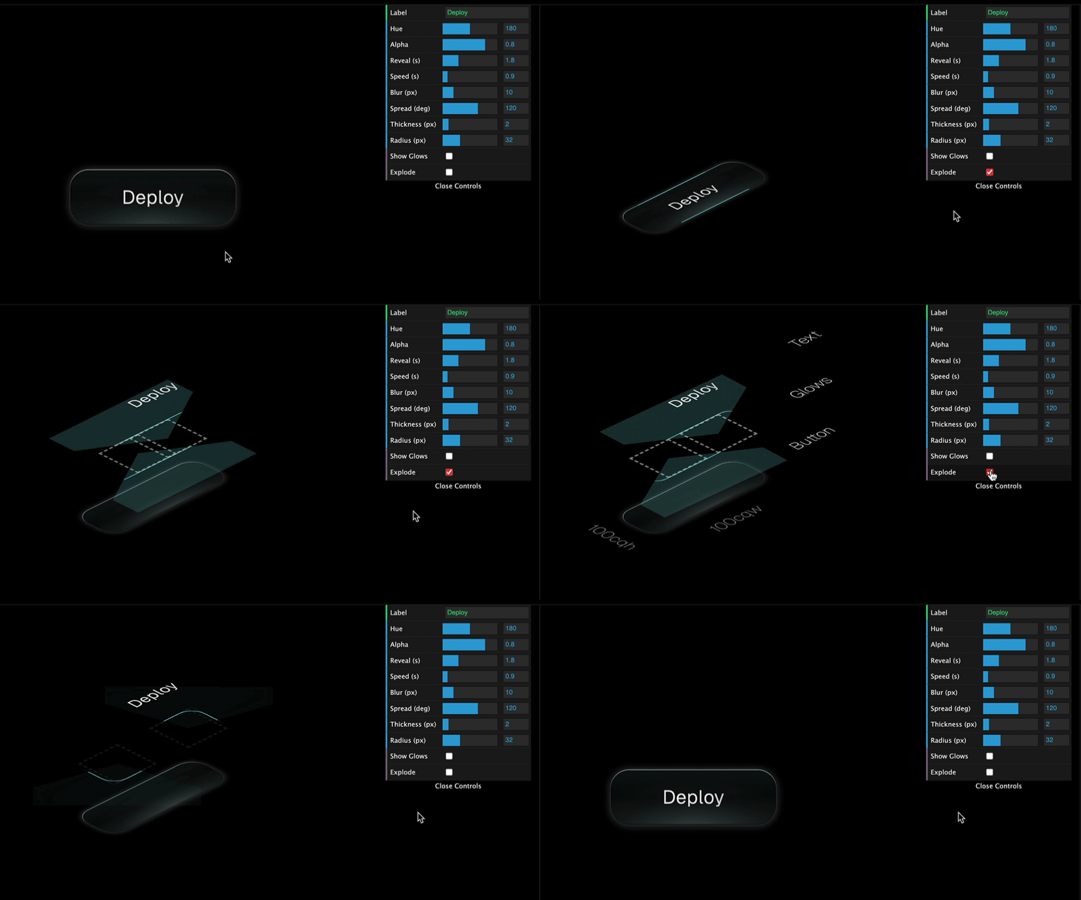
Jhey Tompkins' Codepen profile is worth visiting because he publishes a ton of impressive CSS demos.
This button example coming with interactive controls blew me away.
If you're not paying for YouTube right now, you may have noticed that the service ramped up its efforts to nudge us all to switch to premium or at least turn off adblockers.
Zhenyi Tan describes how adblockers block ads and how YT makes it harder and harder to do so.
Okay, this is wild! How many lines of JS do you need to record your screen and save it to a file? 20. That's it. 🤯
From the unlimited MDN knowledge archive...
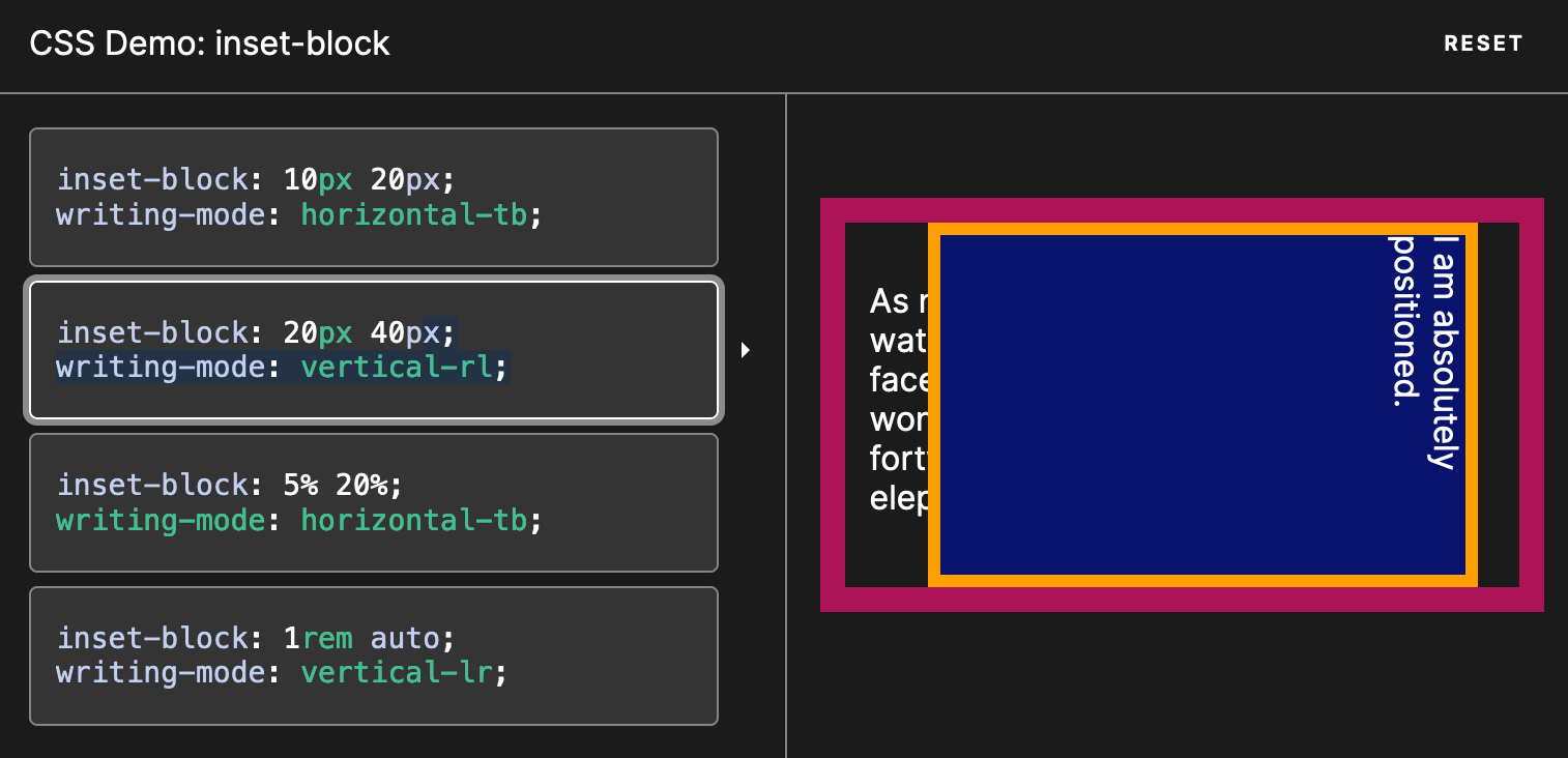
You might know that inset is a shorthand for top, right, bottom and left. But did you know that there's also inset-block and inset-inline?
These properties consider the writing mode, whereas inset doesn't. 🤯
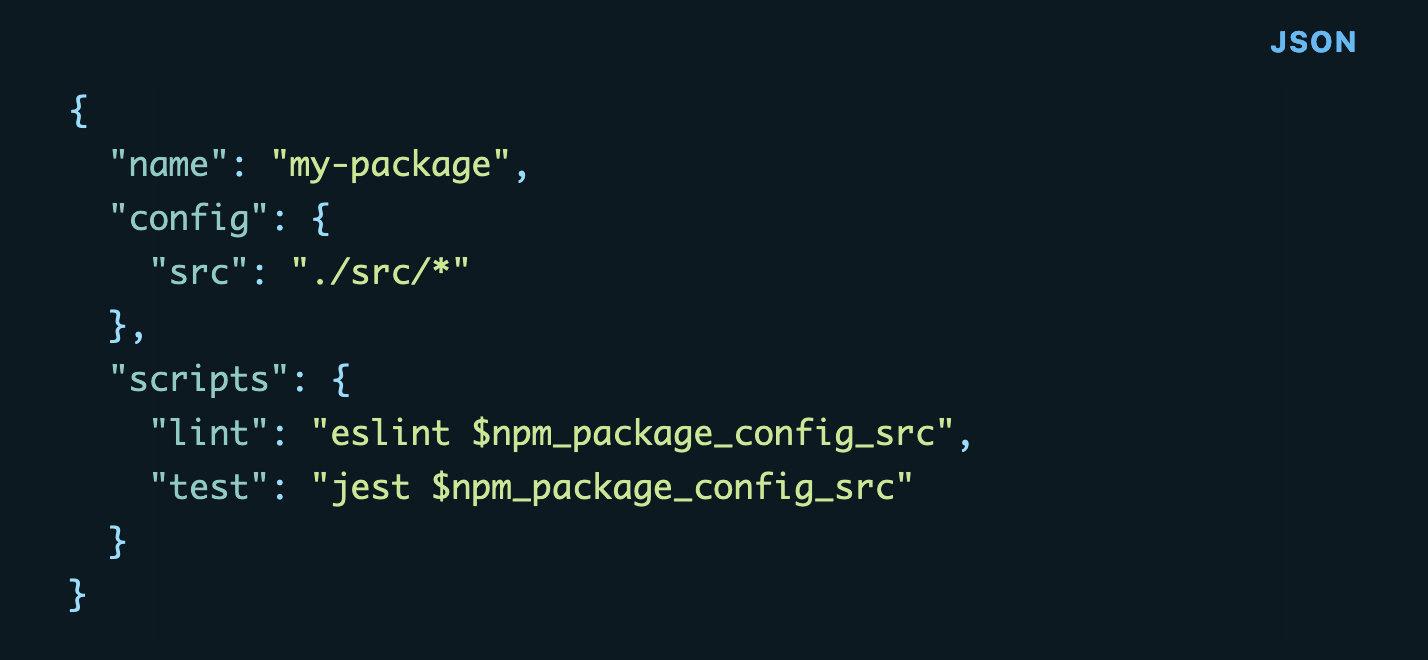
You probably want to avoid repetition if you're maintaining complex npm scripts. Reusing package.json properties might be helpful here.
Find more short web development learnings in my "Today I learned" section.
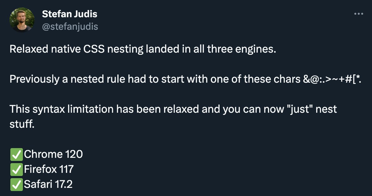
It's time, friends! 🎉 This week's biggest platform news was that relaxed CSS nesting landed in all three main engines.
What's relaxed nesting? When browser vendors started looking into supporting native CSS nesting, the first draft included the limitation that nested selectors must begin with one of these characters: &@:. You couldn't "just" nest things and had to prepend a & if you wanted to nest element selectors.
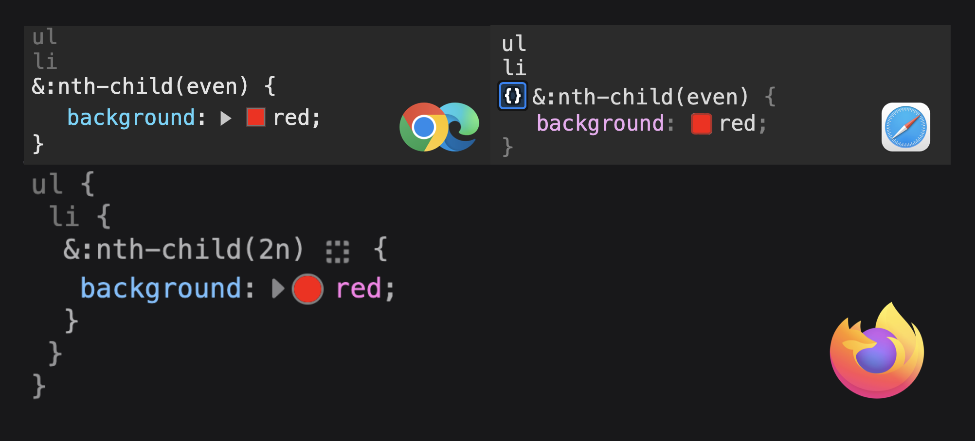
Luckily, this syntax limitation was relaxed, so the behavior is now closer to what we're used to from CSS processors. And Chromium was the last engine to implement the change. In a few browser releases, it's finally time to ditch some tooling and rely on native nesting. But how will browsers display nested CSS rules in the developer tools?
As you see, Firefox does a good job by rendering the entire nested CSS rule. Chromium and Webkit, on the other hand, don't make it very clear what we're looking at.
Let's see when and if they will improve their dev tools.
I'm stunned! Maybe you want to receive the Web Weekly Newsletter every Monday, too?
- zachleat/browser-window – A web component to fake a Safari-esque web browser window.
- juliencrn/usehooks-ts – A TypeScript first React hook library.
- honojs/hono – A small and fast web framework for the Edges.
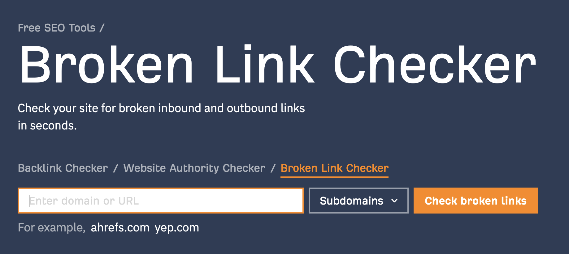
I did some blog winter cleaning, and Ahref's broken link checker was incredibly handy to get rid of links going nowhere.
Find more single-purpose online tools on tiny-helpers.dev.
Did your relationship with work change over the past few years?
We made it through Covid, the climate crisis is unavoidable, the tech world has experienced mass layoffs, and multiple wars are plastering the news — many reflect on their life choices.
Sara Wachter-Boettcher published thoughts on "quiet quitting", motivation (or the lack of it) and life goals, and it included this line that made me sit down and think.
Telling yourself you should want something isn't the same as actually wanting it.
Loved this email? Hated this email? I want to hear about it!
If there’s something that needs to be improved or something that you enjoyed, reply to this email because I want to know more!
And with that, take care of yourself - mentally, physically, and emotionally.
I'll see you next week! 👋
Join 6.2k readers and learn something new every week with Web Weekly.


![:disabled != [disabled]](https://images.ctfassets.net/f20lfrunubsq/4PNb75glAY6ZCCbACwqppA/965bd658776fe68a50bb8f190d6d11d9/Screenshot_2023-11-12_at_15.29.04.png)


